
Building a help center that customers actually want to use can be challenging, especially when customization options are limited by default templates.
In this article, we showcase 11 e-commerce brands that found creative ways to enhance their Gorgias help centers through inspiring center examples that demonstrate design and functionality done right.
Whether you’re launching a new help center or refreshing an existing one, these examples highlight practical design choices that improve customer experience and reduce support tickets.
This article highlights 11 e-commerce brands that transformed their standard Gorgias help centers into customized, branded experiences.
Inspiring Gorgias Help Center Examples
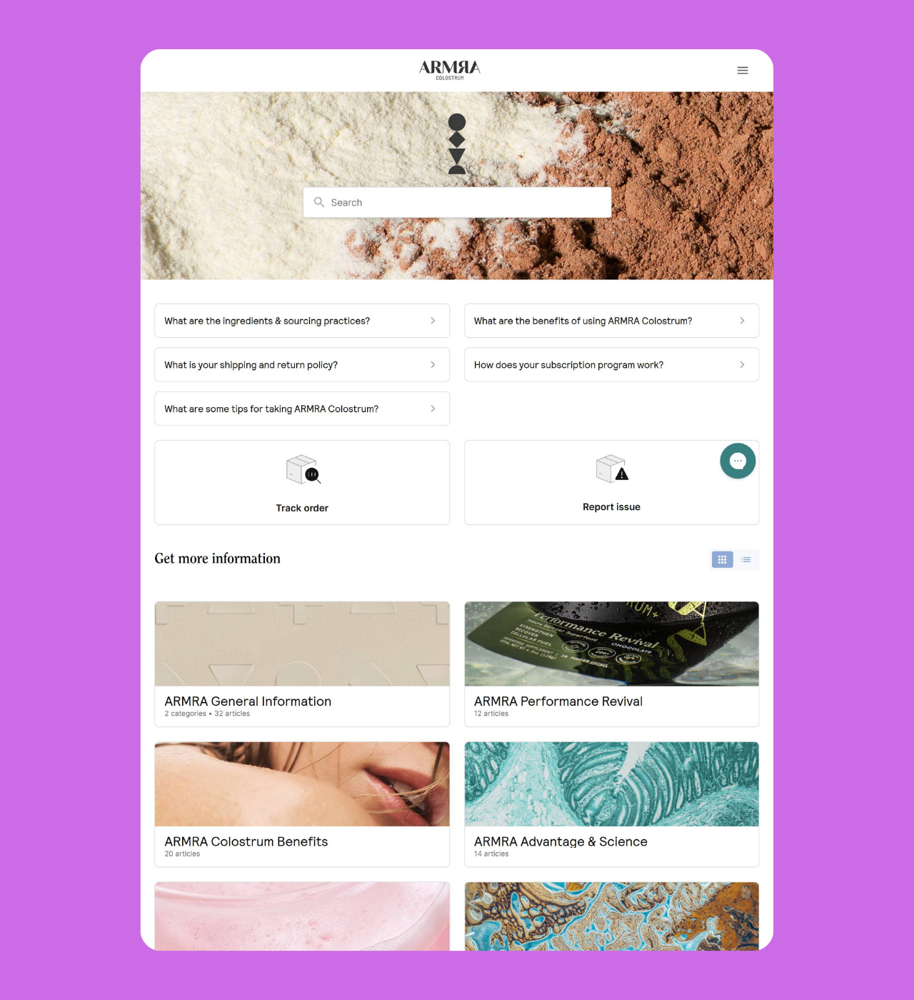
ARMRA
Why it’s great: High-contrast design with comprehensive self-service options
ARMRA’s help center immediately catches the eye with its bold contrasting background image on the search bar. The layout prioritizes the most common customer needs with a prominent search bar positioned at the top, followed by a FAQ section addressing frequently asked questions. This hierarchy encourages self-service while maintaining easy access to help through the chat widget.
Room for improvement: While the FAQ section is well-organized, adding an “expand all answers at once” button would make it easier for customers to quickly scan all available information without clicking through each question individually.
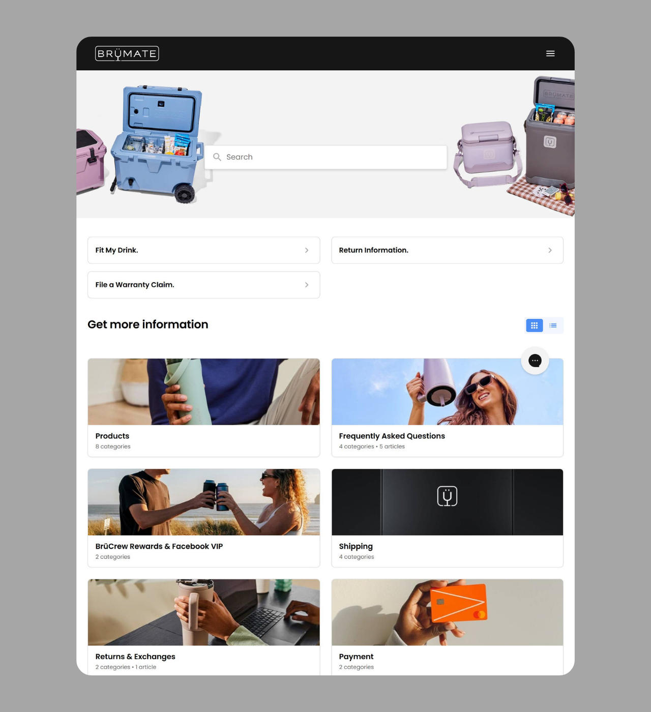
BrüMate
Why it’s great: Product-focused design with multiple contact channels
BrüMate’s search bar has a product image background that strengthens their brand identity .The help center has everything customers need—search, order tracking, FAQs, and clear articles.
But BrüMate takes it a step further by making their email support easy to find. This helps customers feel confident, knowing they can always reach someone if they need extra help.
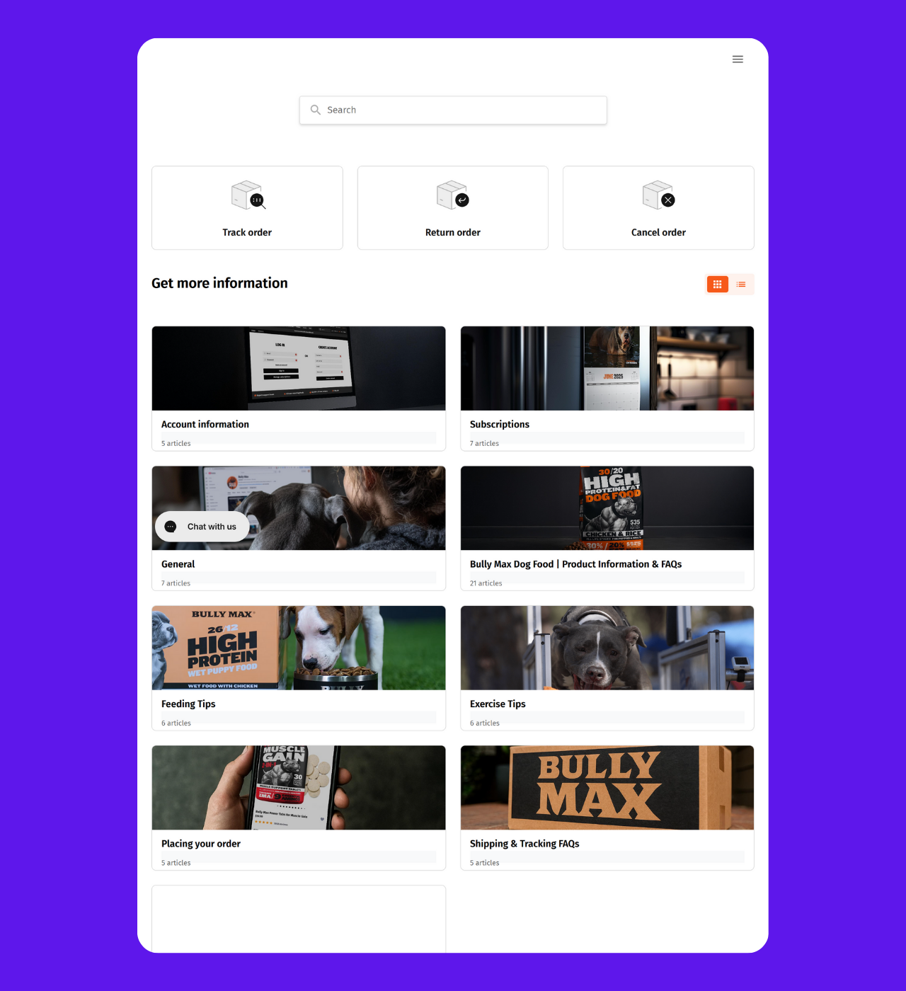
BullyMax
Why it’s great: Pet brand with mobile-first contact options
BullyMax, a brand focused on dog nutrition, designs its help center much like BrüMate’s but adds one key feature—easy-to-find phone support. For pet owners who might have urgent questions, this quick call option brings peace of mind.
The setup follows proven e-commerce layouts but is tailored to their audience. Pet owners value being able to talk to a real person when it comes to their dog’s health and nutrition.
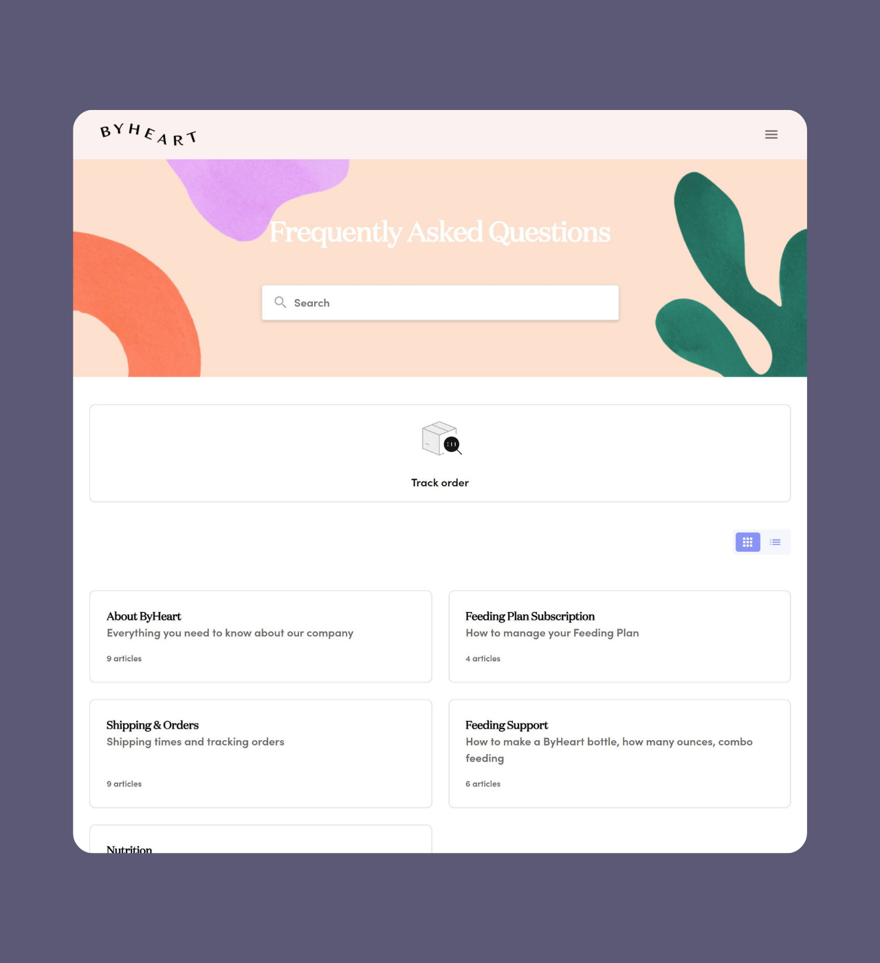
ByHeart
Why it’s great: Minimalist approach with strategic content curation
ByHeart proves that less can be more with their streamlined help center featuring a soft theme that aligns perfectly with their baby nutrition brand. Rather than overwhelming visitors with endless articles, they’ve curated their content thoughtfully using the right order management tools to guide users toward the help they need.
The help center includes essential features—search functionality, order tracking, and categorized articles under main headers—but keeps everything easy to use at a glance. This shorter format helps parents find answers fast without too much scrolling.
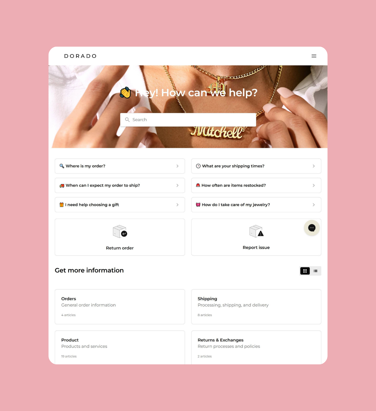
Dorado
Why it’s great: Custom iconography enhances navigation
Dorado’s help center stands out with thoughtful visual design. While it keeps the standard Gorgias setup of FAQs, order tracking, and articles, Dorado adds colorful custom icons that guide users through the page.
These icons do more than decorate—they help customers find what they need faster. With just a touch of color and personality, Dorado turns a basic help center into a true reflection of its brand.
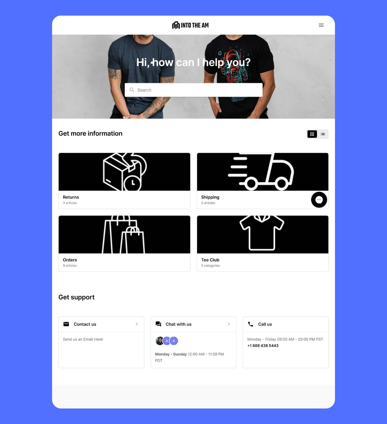
Into the AM
Why it’s great: Bold branding with trust-building visuals
Into the AM stands out with their much longer search bar background. Adding a black background for their Categories header also improves the UX.
What truly builds trust is their customer support section featuring a real person’s photo. This humanizes the support experience, reminding customers there are real people ready to help. The combination of bold design and personal touch creates a help center that feels both modern and approachable.
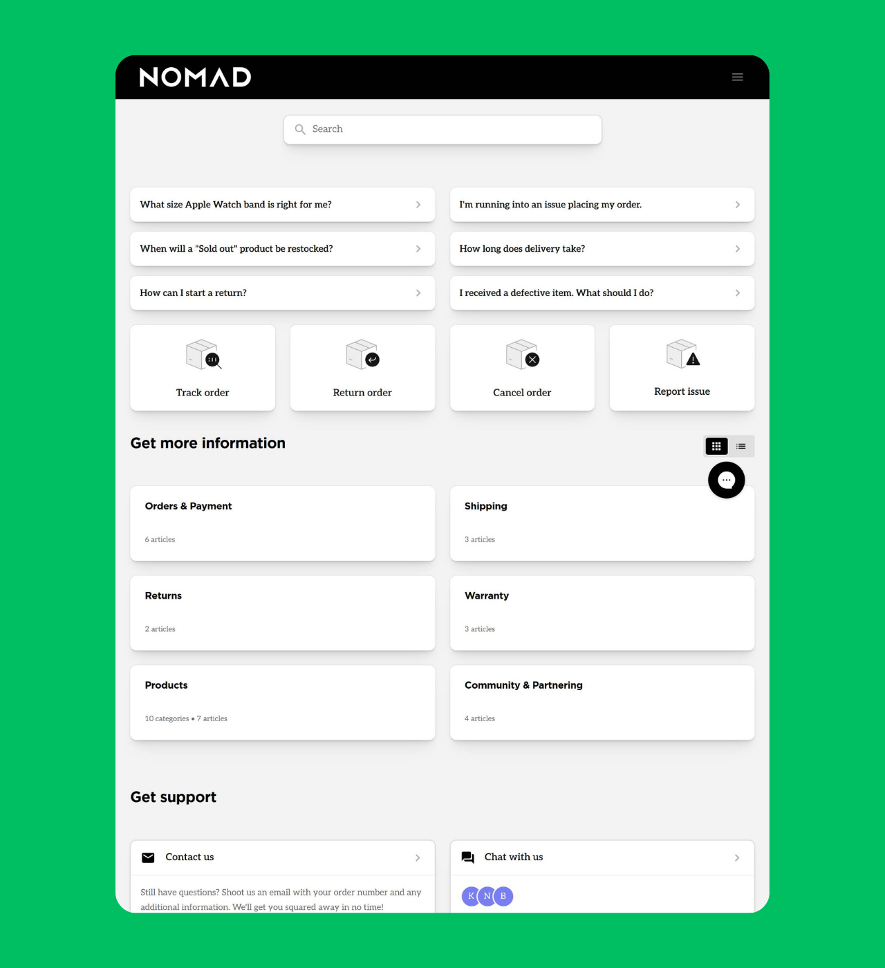
Nomad
Why it’s great: Clean black-and-white design for instant clarity
Nomad’s help center embraces minimalism with a sophisticated black-and-white color scheme. The design isn’t boring—it’s strategic, allowing the content and navigation to take center stage without visual distractions.
Everything a customer needs is easy to see at a glance. The simple layout makes it quick to find and access information. For a tech accessories brand, this clean, practical design reflects their product style—functional, elegant, and user-focused. The well-organized FAQs also make it easy for customers to solve common issues on their own.
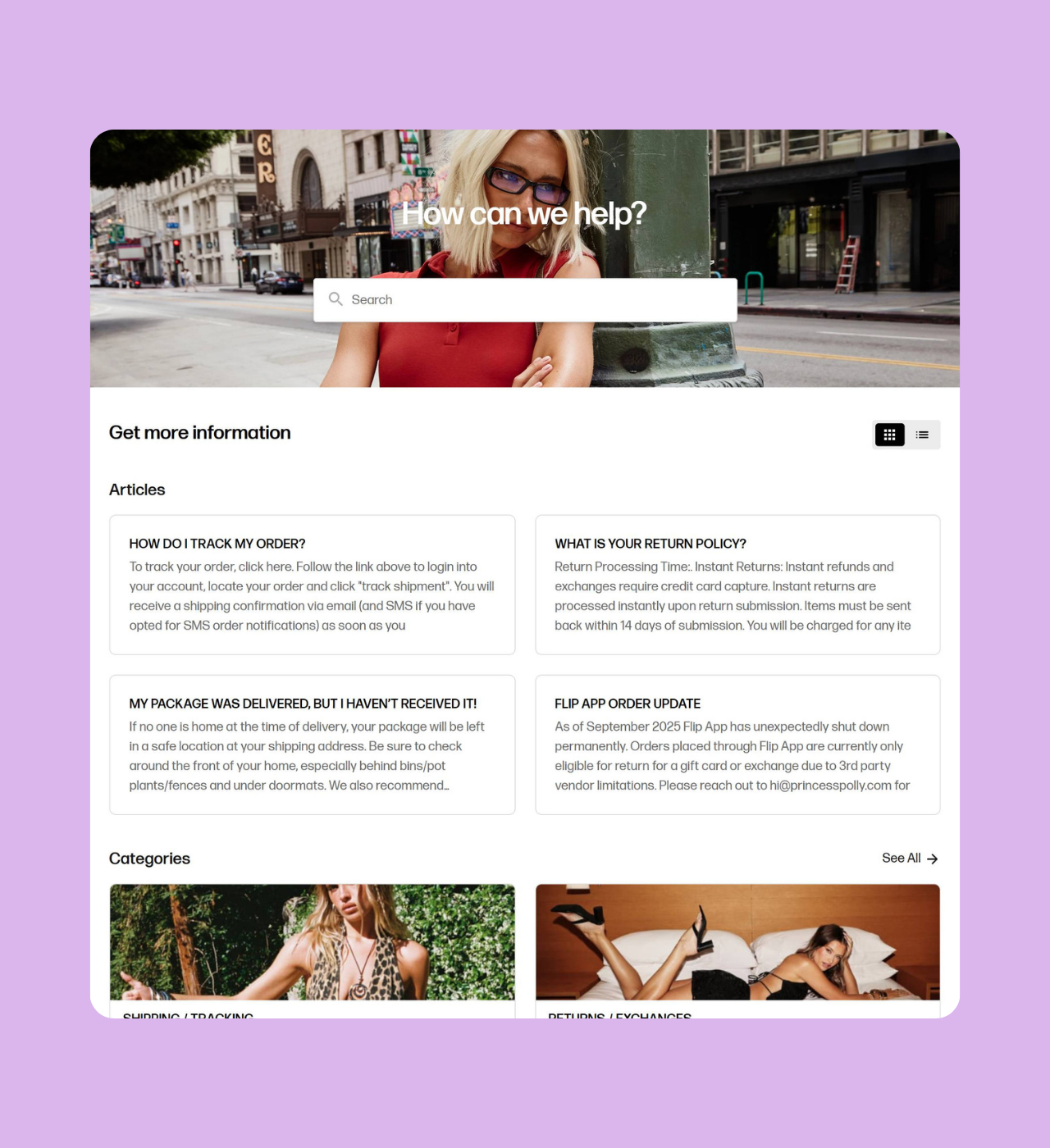
Princess Polly
Why it’s great: FAQ previews reduce clicks and friction
Princess Polly adds a smart touch to the Gorgias setup by showing short answer previews under each FAQ question. For example, a question like “My package was delivered but I haven’t received it” includes the first few lines of the answer to give customers quick help right away.
This preview approach helps customers quickly determine if they’ve found the right article before clicking through. Additionally, their category sections feature attractive product photography that makes browsing support content feel more like shopping—on-brand for a fashion retailer.
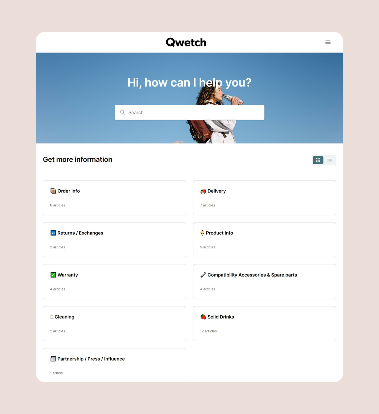
Qwetch
Why it’s great: Concise content with playful iconography
Qwetch’s help center succeeds through simplicity and personality. They’ve kept their help center content deliberately short, recognizing that customers want quick answers, not lengthy explanations.
The addition of custom icons throughout the interface adds visual interest and helps with navigation. For a sustainable products brand, this streamlined approach aligns with their minimalist aesthetic while ensuring customers can find what they need efficiently.
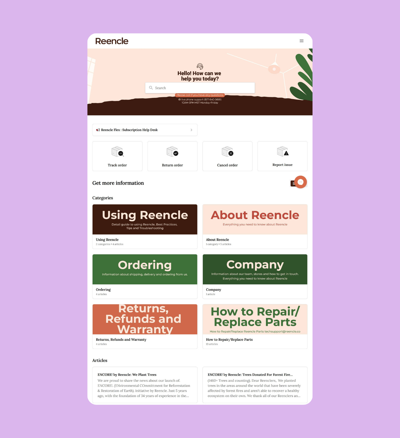
Reencle
Why it’s great: Strategic use of brand colors across categories
Reencle’s help center pops with vibrant colors that reinforce brand identity. What makes their approach effective is how they’ve customized category images with their brand colors, creating visual consistency throughout the support experience.
This color-coding serves a dual purpose: it makes the help center more visually appealing while also helping customers quickly distinguish between different support categories, showing how smart customization can elevate usability and reinforce brand identity.
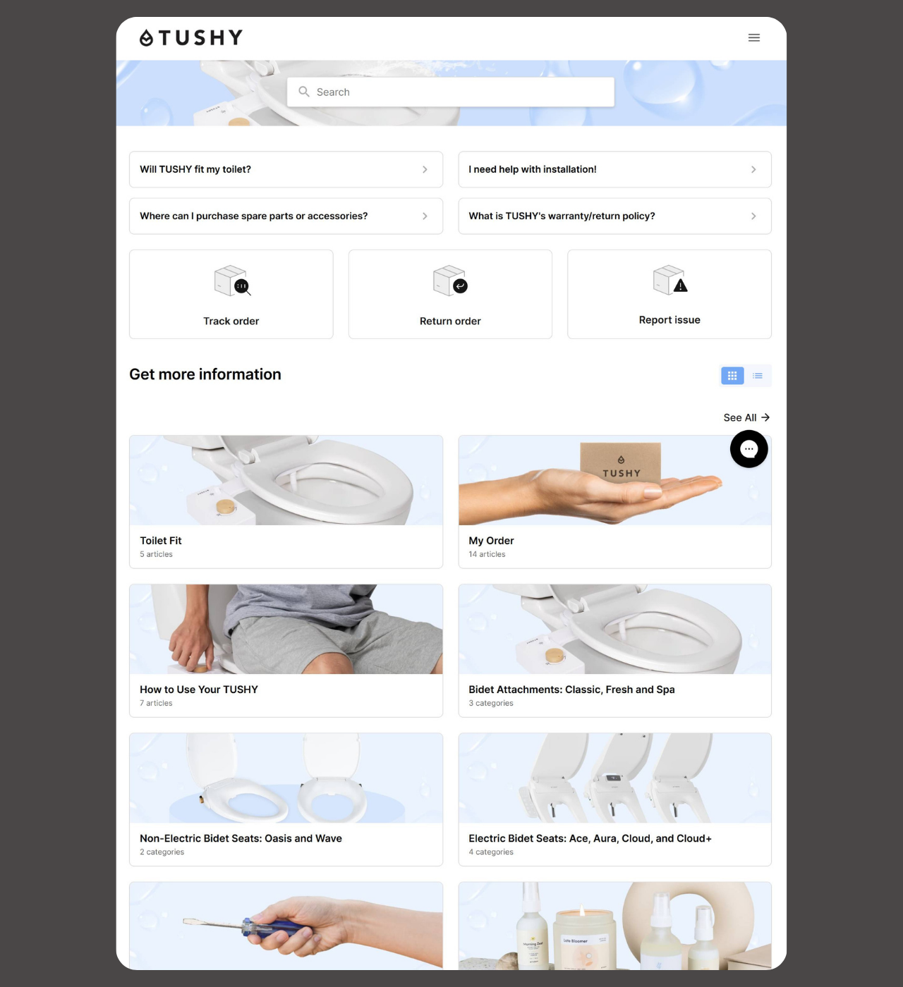
TUSHY
Why it’s great: Comprehensive features with standout design execution
TUSHY’s help center includes all the essential elements we’ve seen—search, tracking, FAQs, organized articles, and multiple contact options. What elevates TUSHY above others is their execution and attention to detail.
In a space where most help centers look alike, TUSHY stands out with smart design, thoughtful customization, clear layout, and strong branding What really sets them apart is their multi-language support, showing that great customer service is about how you use features, not just having them.
Key Takeaways for Building Better Gorgias Help Centers
Even within Gorgias’s standard framework, these e-commerce brands found ways to create distinctive, effective help centers. Here’s what makes them work:
Prioritize Visual Branding: Use brand colors, custom imagery, and thoughtful backgrounds to make your help center feel like an extension of your main website, not a generic support page.
Make Self-Service Easy: Position search bars prominently, organize FAQs strategically, and include order tracking features front and center to reduce support ticket volume.
Show Multiple Contact Options: Display email, chat, and phone support clearly so customers know help is available when self-service isn’t enough.
Use Custom Icons and Imagery: Small visual customizations like icons, product photos, and category images significantly improve navigation and user experience.
Keep Content Concise: Not every help center needs dozens of articles. Curate your content thoughtfully and keep answers clear and scannable.
Consider FAQ Previews: Showing the first few lines of answers helps customers quickly identify relevant articles without clicking through multiple pages.
Match Design to Your Audience: Whether you choose minimalist monochrome or vibrant colors, ensure your help center design aligns with your brand identity and customer expectations.
Host Live Webinars or Q&A Sessions: Brands can also host live webinars or Q&A sessions to demonstrate help center features, share real-world examples, and engage directly with customers.
Whether you are building a help center from scratch or not , by focusing on these elements, e-commerce businesses can create Gorgias help centers that not only assist customers effectively but also enhance brand perception and reduce support costs—proving that well-designed center examples can inspire even better results.