
To get more customers to self-serve, many businesses pick Zendesk for their their help center. But customizing it can be a pain.
In this article, we examine 14 standout Zendesk Help Center examples and take a close look at what makes them highly effective. A good help center should allow customers to self-serve efficiently and without hassle.
Whether you’re building a new help center or looking to improve an existing one, these examples showcase best practices in design, easy navigation, and user experience.
Zendesk Help Center examples
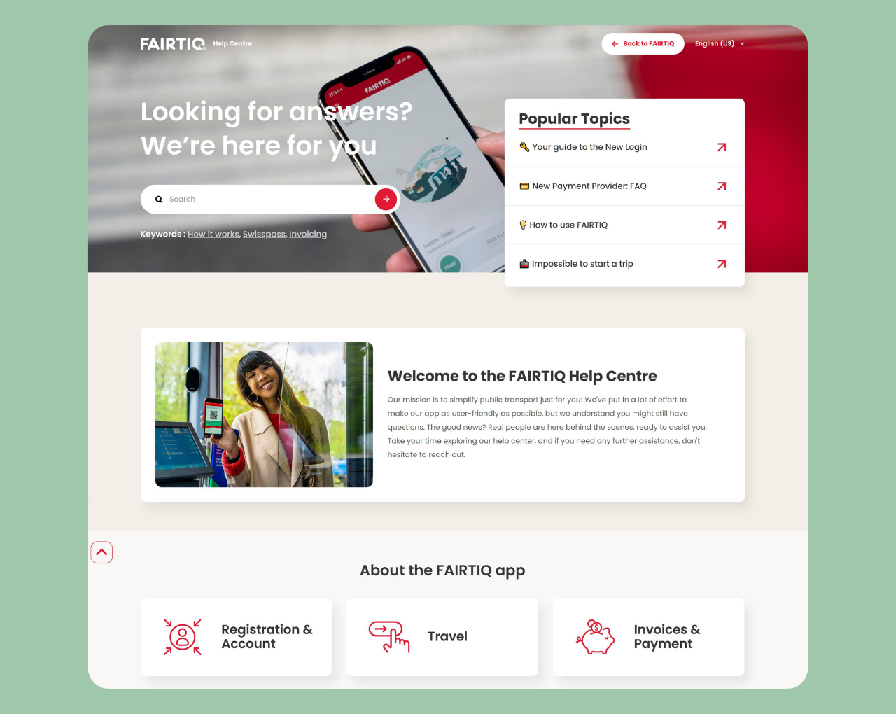
Fairtiq
Why its great: Regional support with vibrant, user-friendly design
FAIRTIQ’s help center is a perfect example of a well designed Zendesk help center. It stands out with its eye-catching background colors that immediately draw users in.
The layout is thoughtfully organized with a faq section positioned prominently in the top right corner and a powerful search feature on the left side.
What makes Fairtiq particularly special is their “Help by Region” feature, ensuring customers get location-specific support.
They actively encourage keyword searches with helpful prompts, making it easier for users to find exactly what they need. The help center flows naturally with how-to guides displayed below the main search area, and a clear contact option for when self-service isn’t enough
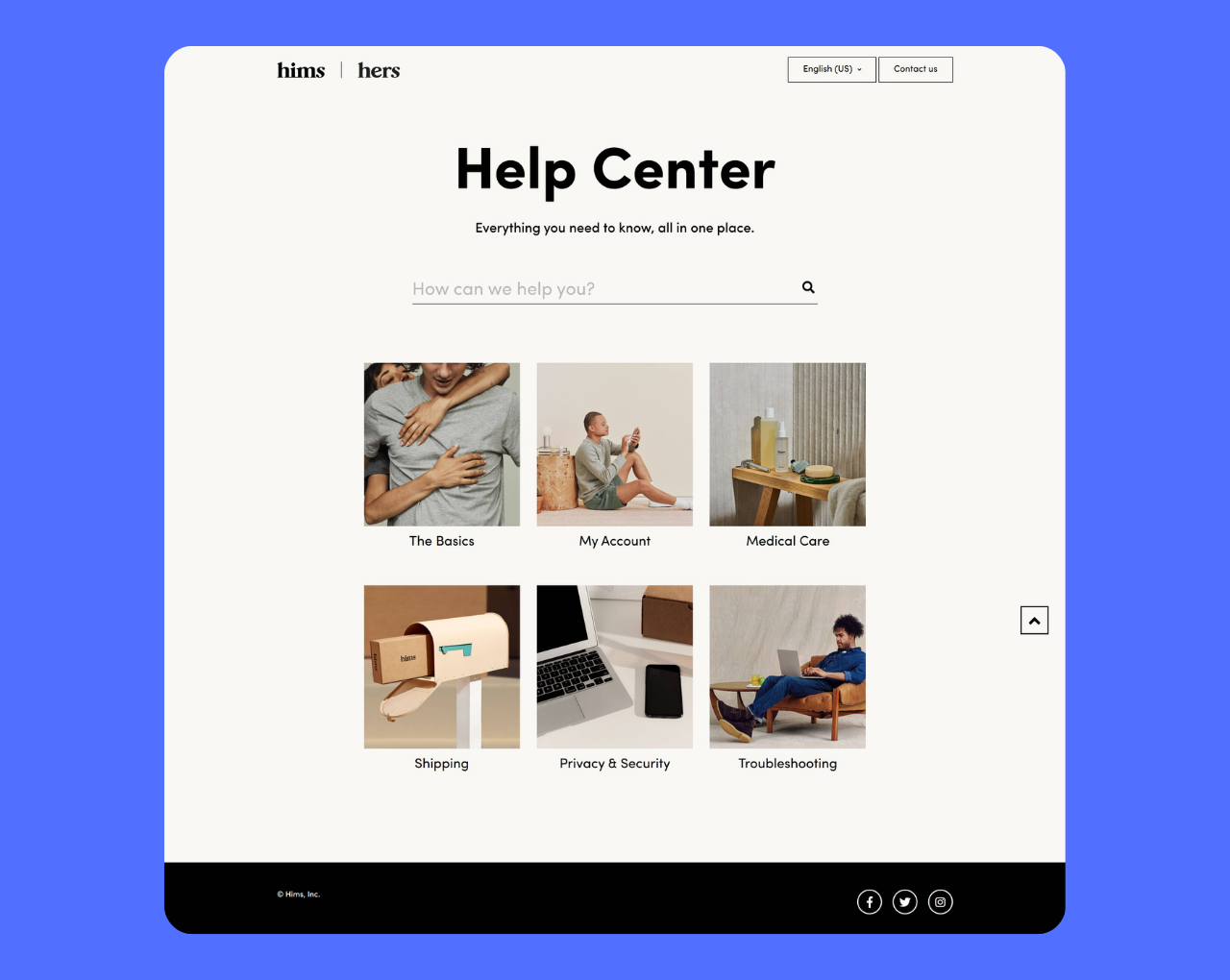
Hims and Hers
Why it’s great: Minimalist modern design with visual grid layout
Hims and Hers delivers a clean, minimalist help center that perfectly mirrors their brand identity. The search functionality takes center stage, complemented by a well-structured three-column grid layout that helps with easy navigation.
Each help category: My Account, Shipping, Privacy and Security, Troubleshooting, and more, is presented as an attractive box with relevant imagery above descriptive text.
This visual approach doesn’t just look good; it helps customers quickly identify the relevant content they need without having to read through lengthy text descriptions. The design is an excellent example that proves that simplicity and functionality can work hand in hand.
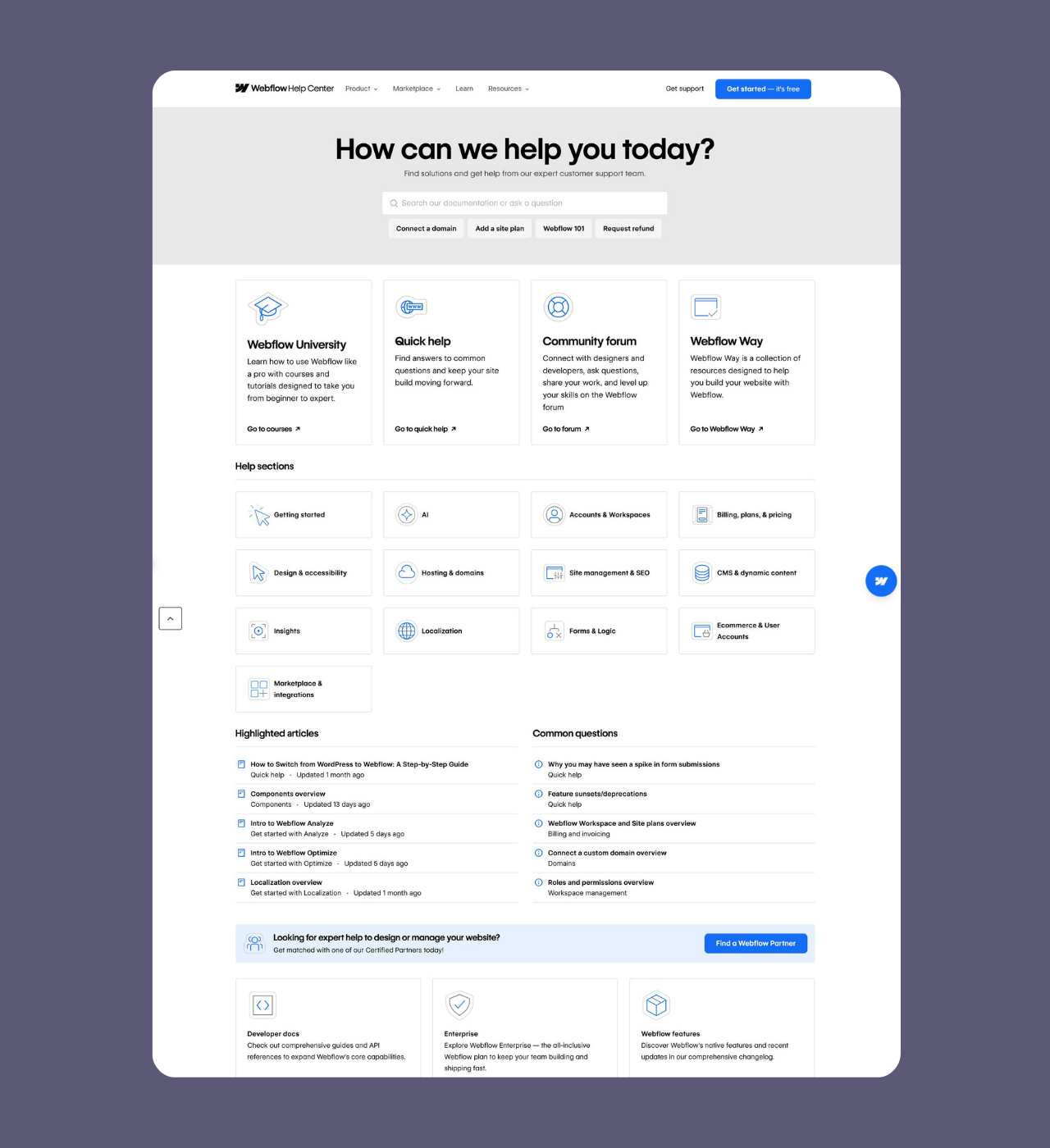
Webflow
Why it’s great: A full resource center
Webflow’s help center is huge. While maintaining a clean, minimalist primarily white color scheme, they’ve packed their help center with an impressive array of resources, including in-depth articles and detailed guides.
The homepage features a search box with keyword suggestions, followed by strategically grouped support categories like Webflow University, Quick Help, and Community Forum.
Help sections are further organized by Getting Started, AI, Accounts and Workspaces, and more. What truly sets Webflow apart is their “Highlight Articles” section displayed in two columns, showcasing the most searched content right on the homepage.
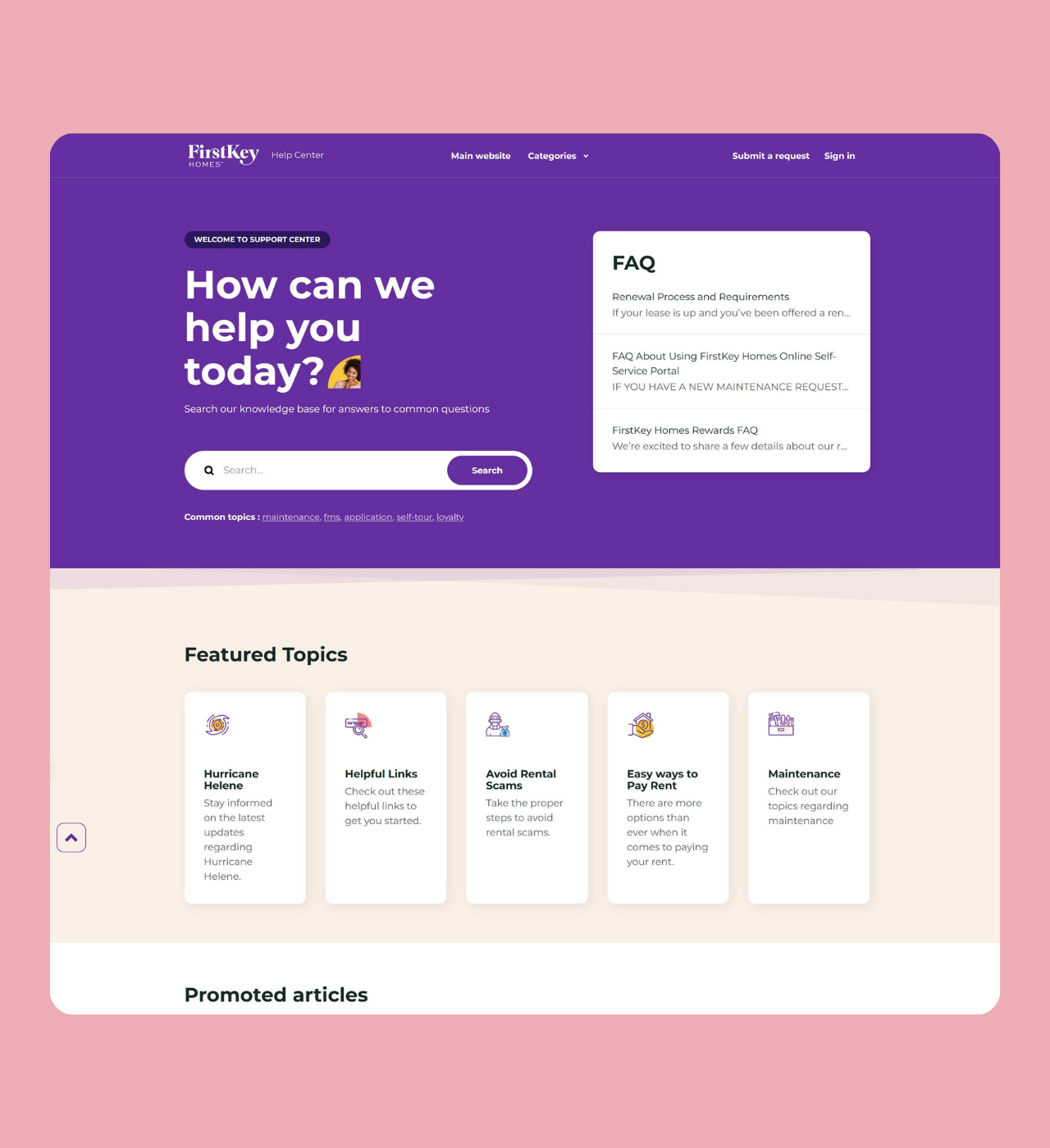
FirstKey Homes
Why it’s great: Specialized support content with engaging purple branding
FirstKey Homes uses a distinctive purple background that immediately sets their help center apart. The interface is designed to guide customers through multiple support pathways, with a search bar on the left, frequently asked questions positioned on the side, and featured highlighting common issues.
Their promoted articles and knowledge base are well-organized, but what really shines is their specialized contact options—including specific forms for specific user problems. When customers can’t find what they need, a clear “Can’t find what you’re looking for?
Submit a request” prompt ensures no one is left without support. This thoughtful structure shows they understand their diverse customer base needs different types of assistance.
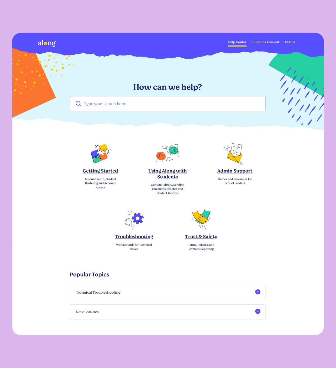
Along
Why it’s great: Playful, kid-friendly design with artistic touches
Along’s help center perfectly reflects their mission of working with children through its colorful, watercolor-inspired graphics. The vibrant background and artistic elements create a welcoming atmosphere that feels both professional and approachable.
The content is organized into clear groups: Getting Started, Using Along with Students, and Admin Support, displayed in a flexible wrap-style layout without borders for a softer, more organic feel.
Popular topics are easy to find, and the overall design prioritizes simplicity—perfect for educators and parents who need quick answers without overwhelming complexity.
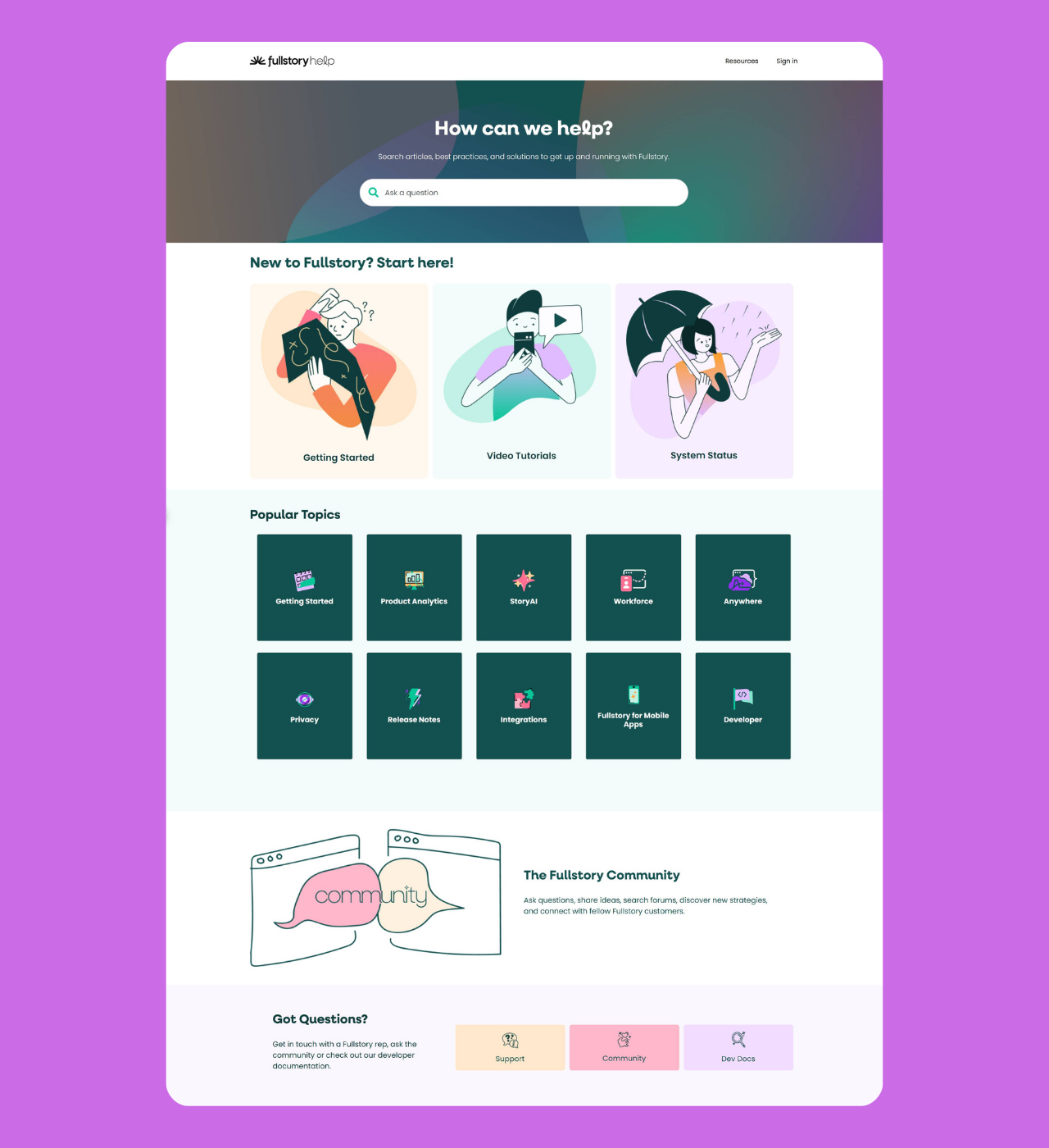
Fullstory
Why it’s great: seamless blend of brand identity and support
FullStory strikes the perfect balance between professional and approachable with their unique computer-drawn graphics that remain minimalist yet engaging.
Their “Start Here” section features three well-organized columns: Getting Started, Video Tutorials, and System Status, each with distinctive imagery that guides users naturally through the interface improving customer experience.
The help center includes Popular Topics for quick access to common questions, and a dedicated “Got Questions?” section that directs users to support, community forums, and developer documentation. This multi-channel approach ensures every type of user—whether technical or non-technical—can easily navigate.
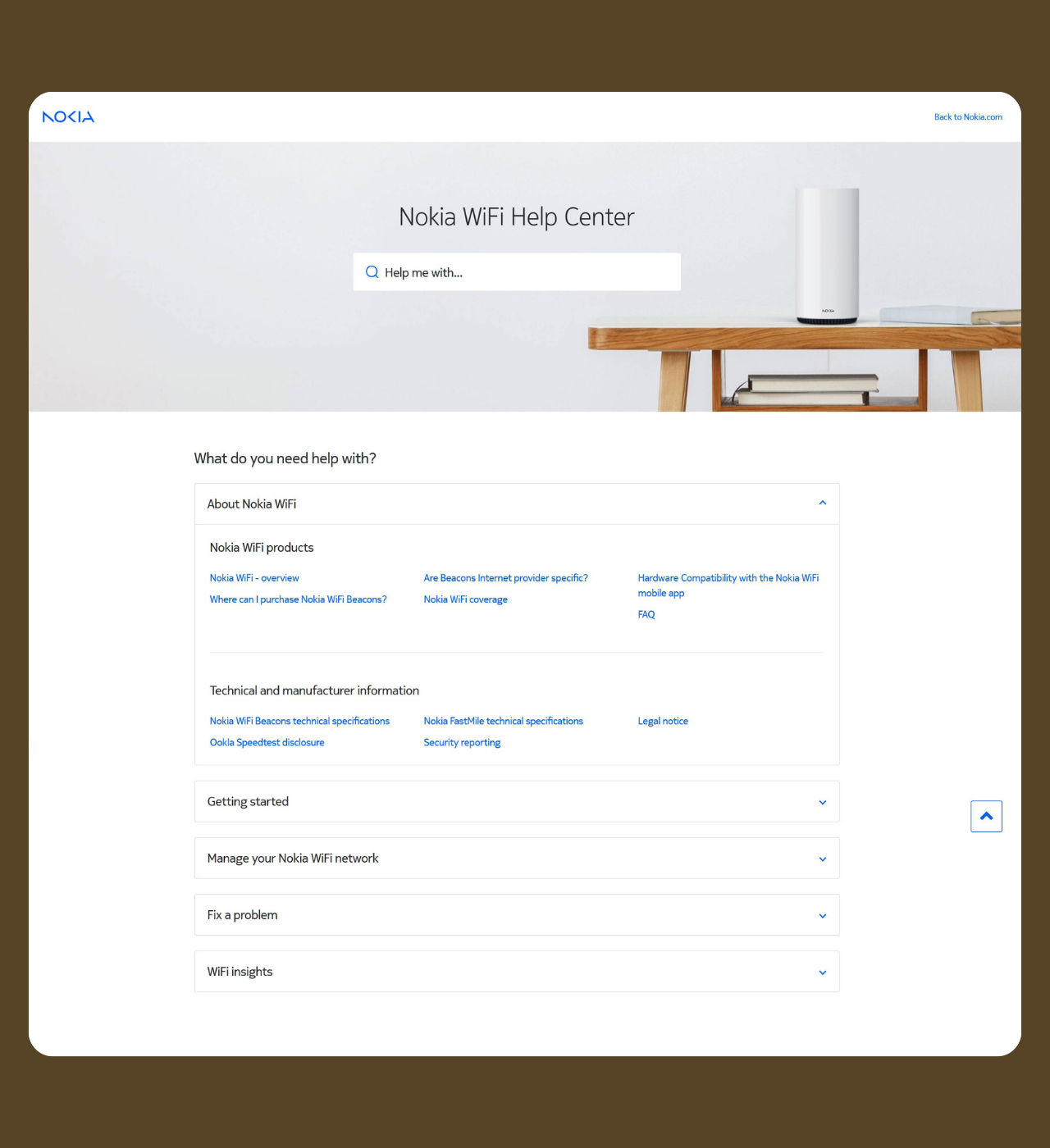
Nokia WiFi
Why it’s great: Modern toggle-based navigation with multilingual support
Nokia’s WiFi help center showcases a sleek, modern design with an intelligent search feature complemented by toggle button navigation. This accordion-style interface keeps the page clean while offering extensive information.
For example, clicking the “About Nokia WiFi” toggle reveals detailed subcategories like Nokia WiFi products overview, purchasing information, coverage details, hardware compatibility, and FAQs—all neatly organized without overwhelming the user.
The addition of language selection options demonstrates Nokia’s commitment to serving a global customer base, making this help center accessible to users worldwide.
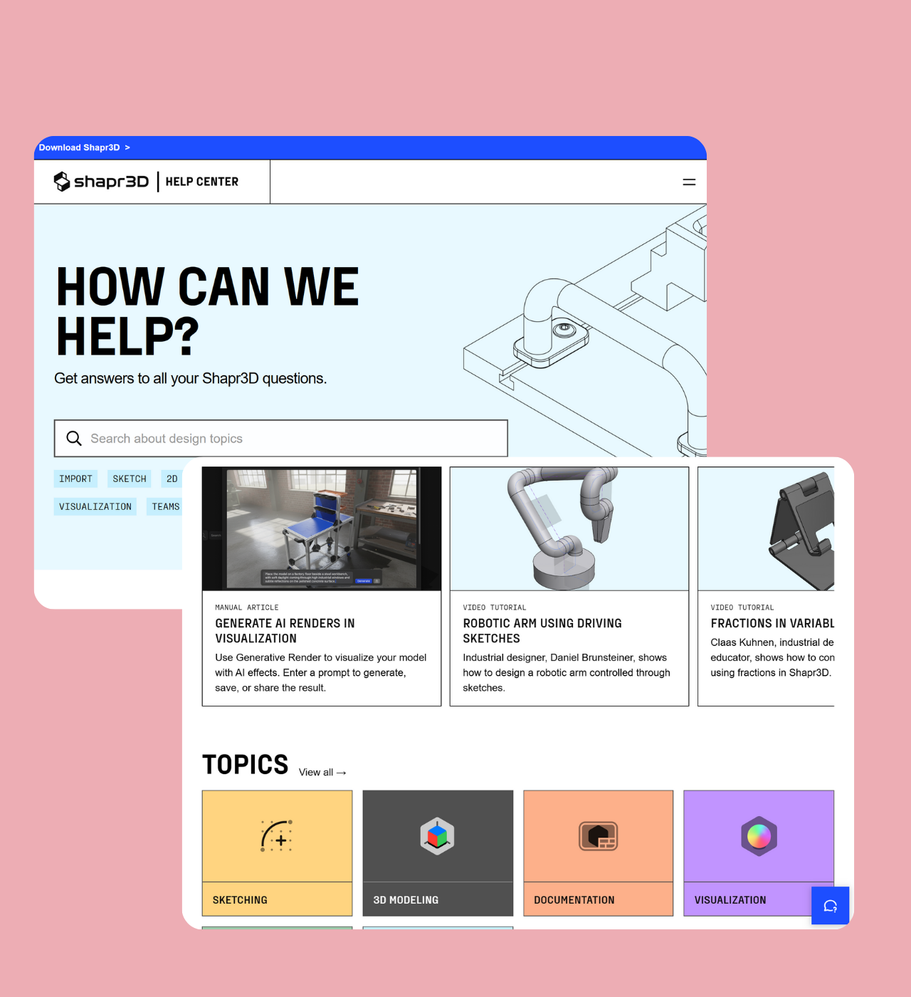
Shapr3D
Why it’s great: Custom video gallery for elevated support
True to its engineering roots, Shapr3D takes a thoughtful, solutions-focused approach to its help center by incorporating video tutorials for enhanced customer support.
Instead of burying these videos within individual help articles, Shapr3D showcases them in a dedicated video gallery right on the help center homepage.
This visually appealing design makes it easier for users to find and access step-by-step guidance quickly. It’s a smart way to engage customers while providing practical, easy-to-follow support that recognizes many users prefer visual learning.
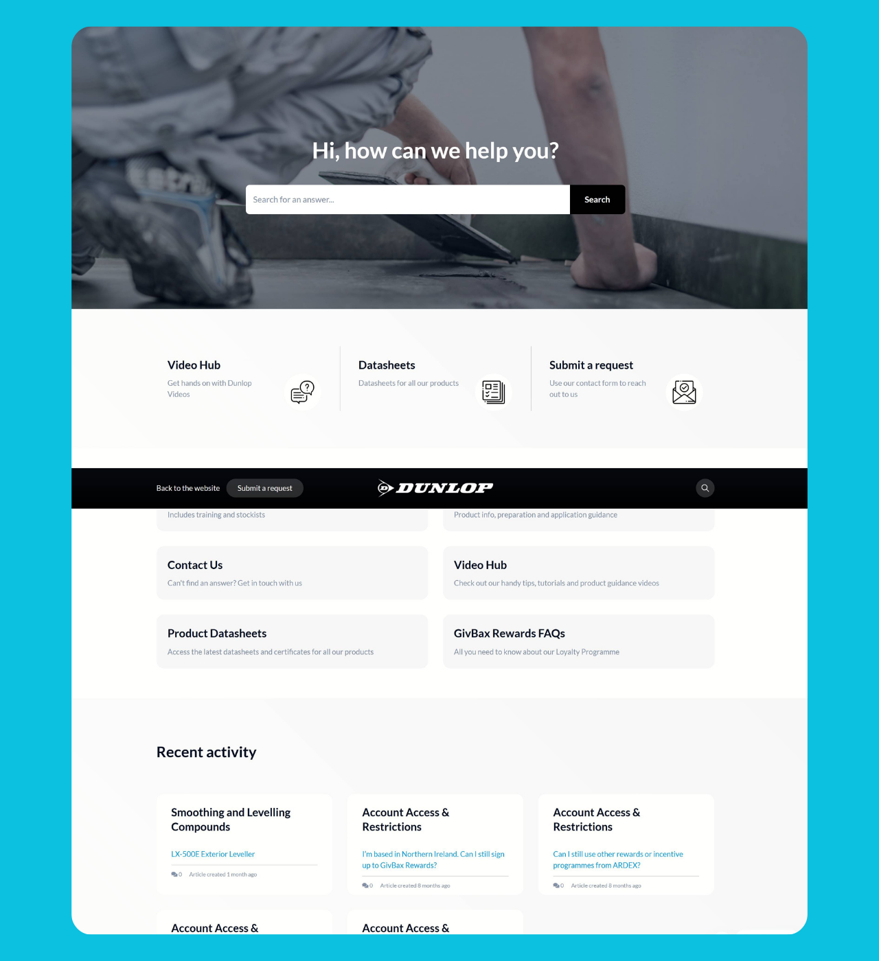
Dunlop trade
Why it’s great: Resource-rich hub with specialized content sections
Dunloptrade transforms their help center into a comprehensive resource hub with clearly defined sections. The interface features a prominent search bar alongside specialized hubs: a Video Hub for hands-on tutorials and product guidance, a Datasheets section for technical specifications, and organized FAQ categories covering both general questions and product-specific guidance.
The help center intelligently separates content into General FAQs (including training and stockist information) and Product FAQs (covering preparation and application guidance).
Recent activity is displayed prominently, showing users what content has been recently updated or added. Their GivBax Rewards FAQs demonstrate how they’ve integrated loyalty program information directly into the support experience. When self-service doesn’t suffice, multiple “Submit a request” options ensure customers can easily reach out.
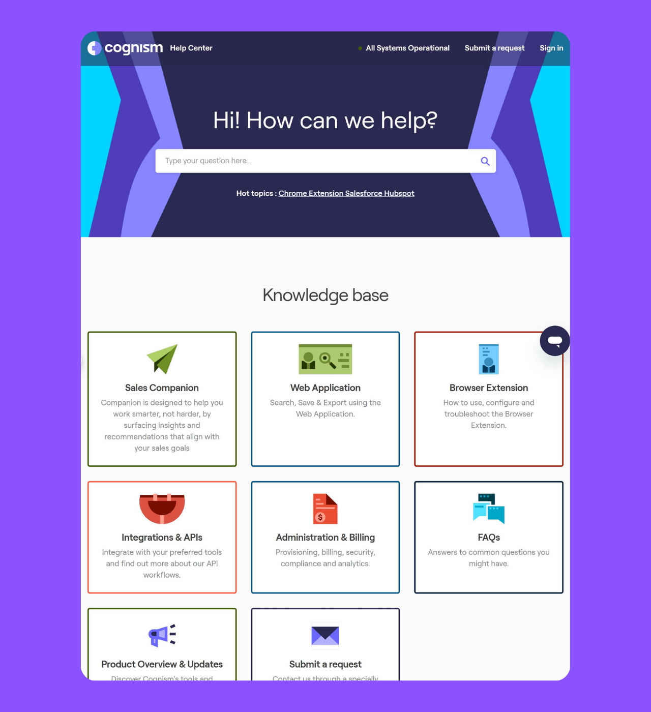
Cognism
Why it’s great: Maximal use of Zendesk help center features
Cognism fully leverages Zendesk’s customization options to create a help center that’s both functional and highly engaging.
It combines easy search functionality with clearly categorized blocks, helpful keywords to guide users, and a branded interface with a sticky site header for seamless navigation.
But Cognism doesn’t stop there. They elevate the experience by adding custom elements like video content and direct links to blogs, podcasts, webinars, and more.
Everything is packaged in a clean, modern design that keeps the interface intuitive and polished. This comprehensive approach turns their help center into a true all-in-one support hub.
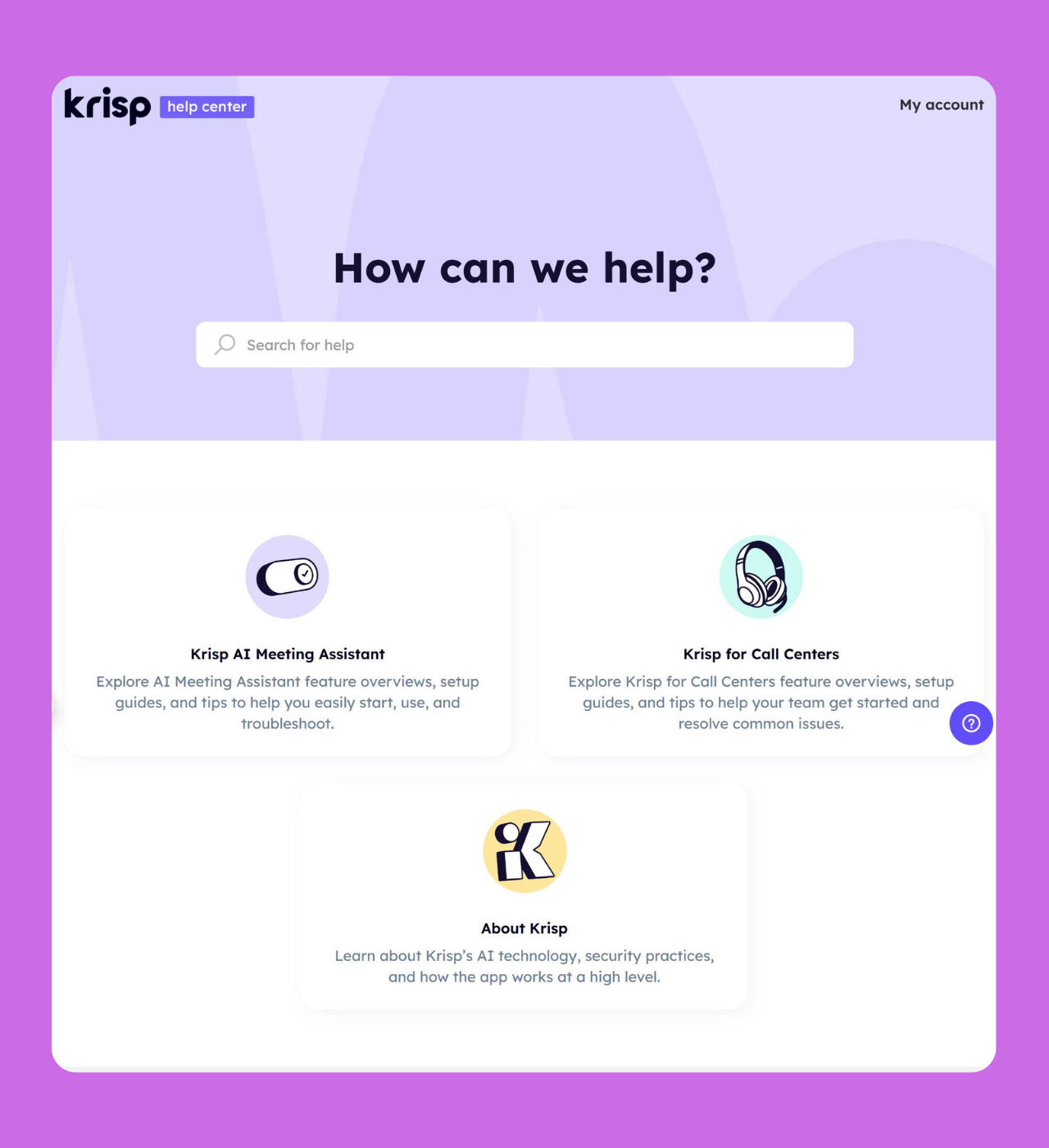
Krisp
Why it’s great: Beautifully designed and branded with interactive elements
Krisp’s help center prioritizes design and branding, creating a seamless extension of the company’s website.
The help center feels clean, approachable, and easy to navigate, with a sticky navigation header and an airy layout. By using plenty of white space and keeping homepage elements minimal, Krisp ensures the experience remains visually light and functional.
What truly sets Krisp apart is how they infuse their brand personality into the help center. Interactive hover animations on the category blocks add a playful, unexpected touch, making the experience more dynamic and engaging.
This thoughtful design not only highlights the brand’s creativity but also makes finding information more enjoyable for users.
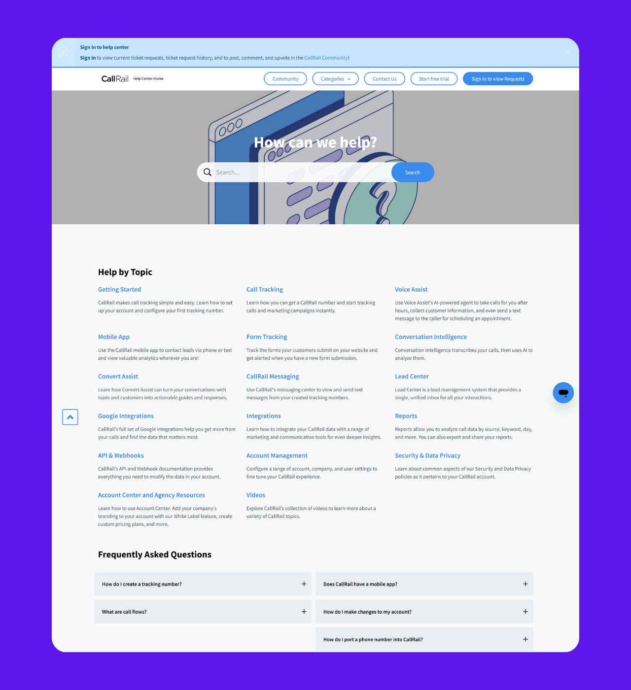
CallRail
Why it’s great: Clean user interface with ample self-serve features
CallRail makes the most of its extensive knowledge base by focusing on clean UX and keeping the design simple, avoiding unnecessary imagery and complex elements. This approach ensures users can quickly find what they need without distractions.
One standout feature is their FAQ section, positioned right below the list of help topics. This smart design allows users to bypass topic sorting and jump straight to answers for common issues, making self-service even more efficient.
CallRail takes it a step further by customizing its help center to include a community board where customers can interact, share knowledge, and troubleshoot together. This proactive approach encourages collaboration and greatly enhances the self-serve experience for users, turning their help center into a truly valuable resource.
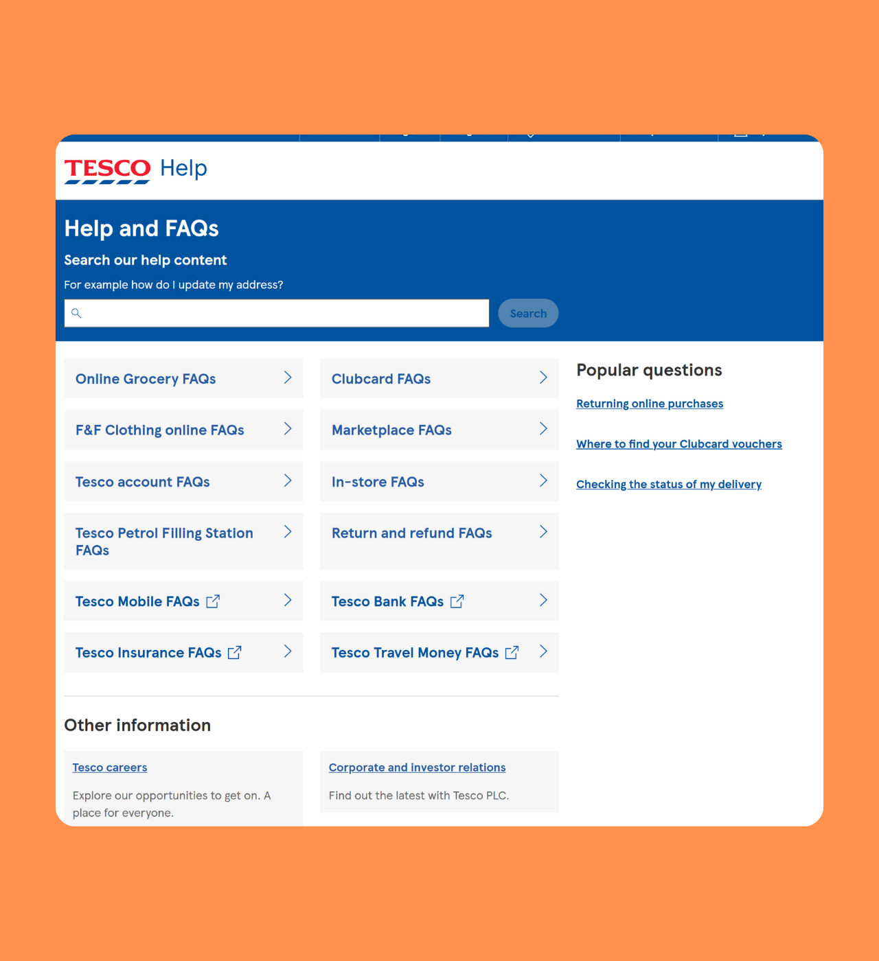
Tesco
Why it’s great: A search-friendly interface
Tesco takes full advantage of Zendesk’s generative search functionality by placing the search bar front and center in their help center.
They even guide users with a helpful example of how to format their query, making it easier to get accurate results. By keeping the help center categories smaller and less visually dominant, Tesco emphasizes the search option. This smart design choice encourages customers to rely on search for faster, more relevant answers, delivering a smoother, more efficient support experience.
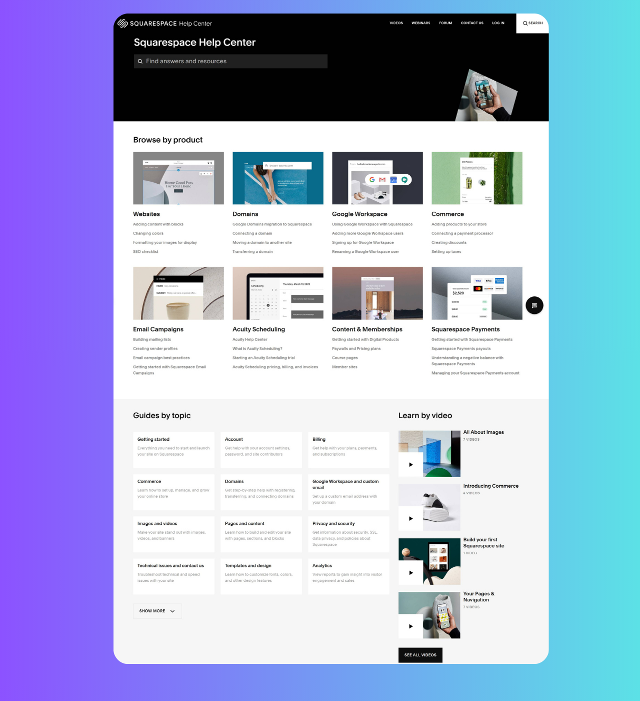
Squarespace
Why it’s great: Stellar UX and navigation
Squarespace’s help center is a perfect example of how thoughtful UX can create a seamless support experience. With powerful generative search functionality, easy-to-navigate category blocks, and flexible browsing options—by topic or by product—Squarespace gives users multiple ways to find the information they need quickly.
What sets it apart is the customized help center design. By using a unique footer and main navigation that differs from their main website, Squarespace transforms their help center into an all-in-one support hub rather than just a collection of FAQs. For a brand like Squarespace, this approach empowers and educates users, helping them achieve success with the platform while feeling fully supported along the way.
To create a help center that stands out, businesses should focus on several key areas:
Prioritize Search and Navigation: Implement an effective search bar that delivers accurate, frustration-free results.
Offer Diverse Content Formats: Combine articles, video tutorials, and troubleshooting resources to address different user preferences.
Customize the center theme: Ensure the help center’s design is visually appealing and has an intuitive navigation, as customers will spend time here when they have issues. A seamless, branded experience enhances satisfaction.
Maintain Clear, Simple Language: Avoid using difficult to understand technical terms.
Support multiple languages: For businesses with an international reach, providing multilingual support is crucial for accessibility and customer service.
Integrate a Community Forum: Customers are delighted when they see someone has had the problem they had before and have found a solution. Community forum makes that possible.
By focusing on these elements, businesses can create a Zendesk help center that not only assists customers effectively but also enhances overall customer satisfaction and loyalty.