


Most roundups of help centers grade on looks. But a polished theme has never resolved a ticket. The knowledge bases worth copying make answers fast to find, match how users actually phrase problems, and stay accurate after the product ships again on Friday.
That last part is where most teams lose. Below are 15 of the best knowledge base examples: 14 live customer-facing help centers plus Ferndesk, which is the maintenance layer behind a help center rather than another site to browse. The list spans developer tools, ecommerce, hardware, education, logistics, and major SaaS brands. Internal, team-facing knowledge bases get their own section later.
- Who this is for: SaaS founders, support leads, product managers, and documentation owners who need a swipe file, not inspiration.
- How these were selected: search quality, structure that follows user intent, plain language, feedback loops, and evidence of ongoing maintenance.
- What to copy: one specific pattern per example, plus the tradeoff you inherit if you copy it badly.
What is a knowledge base?
A knowledge base is a structured library of articles, guides, and reference content that lets customers or team members find answers without contacting support. Customer-facing knowledge bases handle product questions, troubleshooting, and account tasks. Internal knowledge bases serve support agents, new hires, and cross-functional teams who need consistent, up-to-date information to do their jobs.
Businesses build them for a short list of reasons that compound quickly:
- Ticket deflection: customers who find answers themselves never open a ticket.
- Consistent support answers: agents and self-service users read the same source of truth.
- Faster onboarding: new hires follow a documented path instead of asking the same questions repeatedly.
- Lower support costs: a well-maintained knowledge base scales without adding headcount.
- AI accuracy: assistants and chatbots answer from your published content, so clean docs mean better AI answers.
What the best knowledge base examples have in common
Strong help centers share a short list of traits. The features are boring on purpose. What separates the good ones is whether those traits survive twelve months of product changes.
The criteria used in this list
Every example on this list was evaluated against the same six criteria. Design was not one of them.
- Effective search: Users start with a question, not a menu. Strong examples use a prominent search bar that handles typos and synonyms without returning zero results.
- Clear structure: Good navigation reduces browsing dead ends. The best examples use three tiers: collections, categories, and articles, so users always know where they are.
- Plain language: Customer vocabulary instead of internal product names. Every unnecessary word adds reading time and confusion.
- Visuals for complex tasks: Screenshots and short clips appear only where steps involve UI interactions that are genuinely hard to describe in text. Visuals used as decoration add maintenance debt without adding clarity.
- Feedback mechanisms: Thumbs up/down ratings, failed search tracking, and clear escalation paths reveal which articles are weak before customers give up and open a ticket.
- Content that stays current: Stale docs generate new tickets. The examples worth copying have named owners, a review cadence tied to releases, and automated staleness flags rather than a quarterly cleanup that never happens.
Why this matters beyond design
Layout matters far less than whether the knowledge base is organized by user intent rather than your org chart, whether each article has an owner, and whether answers reach people in the moment of need. A help center that mirrors your internal team structure will always feel wrong to a customer trying to fix a billing error. Done well, you get consistent answers across support, success, and sales, higher self-service resolution, and faster onboarding for new hires. None of it holds unless maintenance is continuous, because outdated docs create fresh support demand.
The 15 examples at a glance
| Example | Product type | Standout strength | What to steal |
|---|---|---|---|
| Ferndesk | Maintenance layer | Docs that flag their own staleness | Connect docs to GitHub this week |
| Stripe | Developer platform | Guides split from reference | Separate concepts from API reference |
| Twilio | Developer platform | Use-case-led navigation | Rename categories after real workflows |
| Airbnb | Consumer marketplace | Intent-based categories | Rewrite labels in customer words |
| Dropbox | Multi-audience app | Audience segmentation | Split user and admin content |
| AWS | Enterprise suite | Navigable at huge scale | Standardize one page template |
| Spotify | Consumer app | Shortest path to answer | Cut clicks to top ten answers |
| ReadMe | Developer platform | Docs as product surface | Fix docs UX, not just content |
| Shopify | Ecommerce platform | Merchant-first task framing | Write for the job, not the feature |
| Sonos | Consumer hardware | Device-aware troubleshooting paths | Filter by product before showing steps |
| Duolingo | Education app | Tone-matched support content | Match help center voice to product voice |
| ShipBob | Logistics / 3PL | Operations-grade documentation depth | Document the process, not just the UI |
| Notion | Productivity SaaS | Community-extended docs | Link official docs to community templates |
| Figma | Design tool | Video and visual-first explanations | Use video for spatial or visual workflows |
| HubSpot | CRM / marketing suite | Role-based learning paths | Build separate paths for each buyer persona |
1. Ferndesk
Ferndesk is not a help center to browse and admire; it is the AI-native maintenance layer that sits behind one, monitoring your codebase, support tickets, and changelogs so articles get corrected before customers hit them. It also hosts the front end, so live customer help centers run on it under custom domains or a /help subfolder. An agent called Fern watches GitHub pull requests and Linear activity, drafts the update, and waits for your approval. Pricing is flat and starts at $149/month for the Pro plan, with an early-stage rate of $75/month for pre-seed teams under $1M ARR, and Enterprise from $399/month.
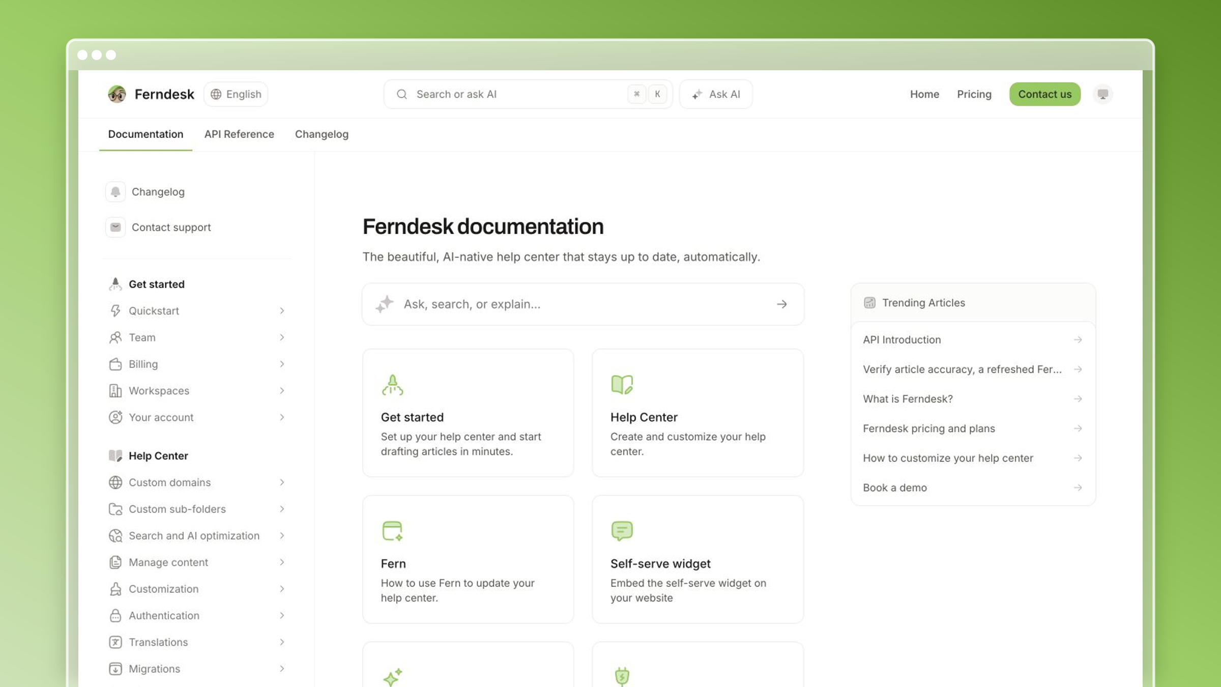
Why it works
- It treats documentation as a living system rather than a publishing project you finish once.
- Automated article drafting from ticket resolutions and automatic gap detection is where knowledge bases are heading, not a bolt-on feature.
- Automation is paired with approval workflows and flat base pricing. Pro includes five editor seats, with additional seats available for $10/month each.
What you should steal
- Build your knowledge base around maintenance signals: commits, tickets, release notes.
- Let recurring support questions decide which article you write next.
- Make screenshot refreshes and stale-content checks part of the system, not a quarterly cleanup.
Best fit and watchouts
- Best for fast-shipping SaaS teams whose docs break every release.
- Strongest when your workflows already live in GitHub, Linear, and Intercom or Zendesk.
- Less relevant if you mainly need a static internal wiki for a product that rarely changes.
2. Stripe
Stripe’s documentation is the reference point most developer-facing teams measure themselves against. It manages to serve someone integrating their first payment and someone debugging a webhook edge case without the two audiences colliding.
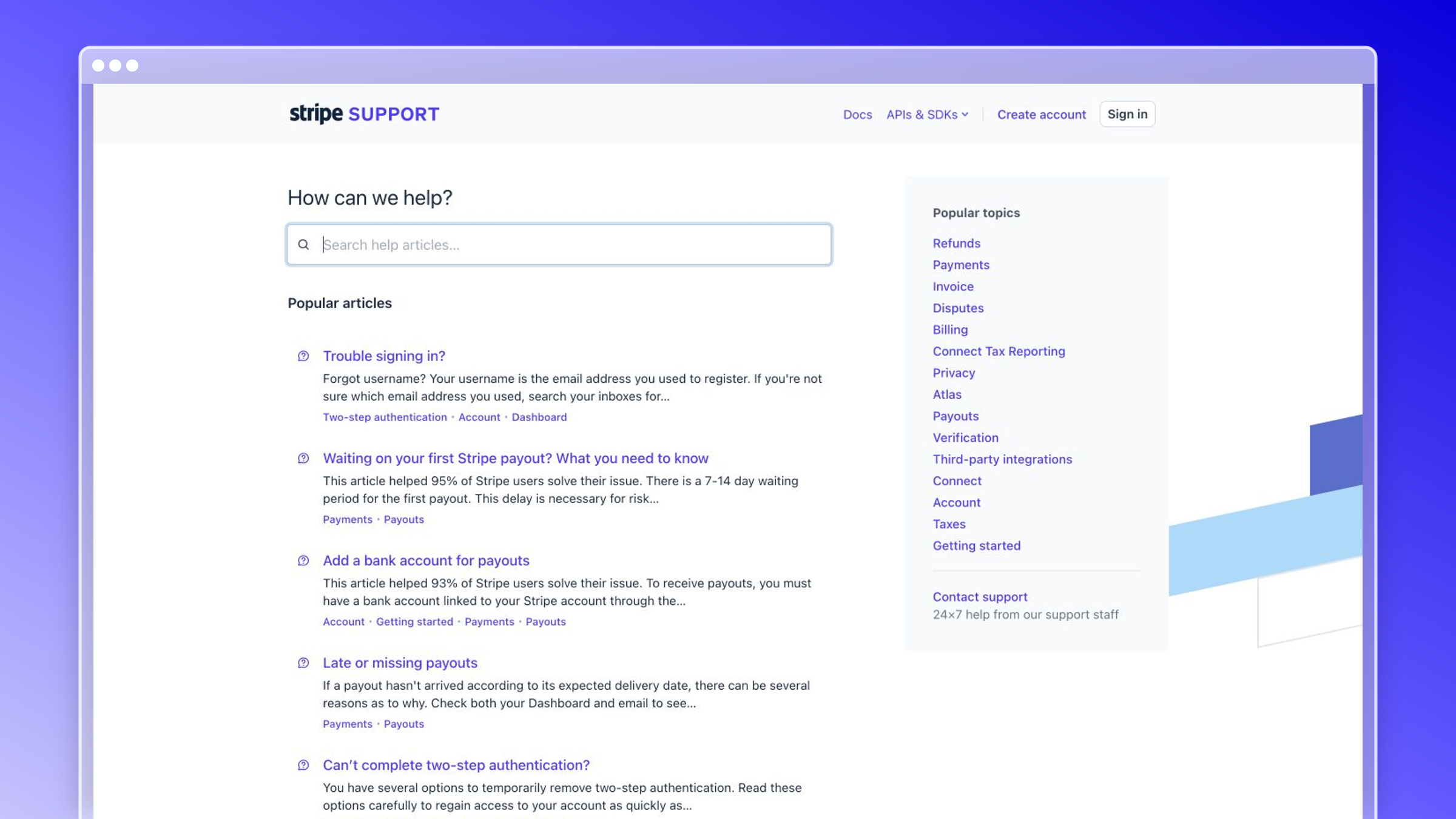
Why it works
- Clean information architecture sits on top of genuinely deep technical substance.
- Developers move from concept to exact implementation detail without losing context.
- The content is task-oriented, so readers solve problems instead of reading reference material.
What you should steal
- Separate conceptual guides from API reference so readers know where to start.
- Use runnable examples and code snippets to remove ambiguity.
- Design navigation for progressive depth, from beginner path to edge case.
Best fit and watchouts
- Best for API-heavy products that need onboarding and deep reference at once.
- A good model when your users span very different skill levels.
- Do not copy the depth unless you have the process to keep it accurate.
3. Twilio
Twilio’s docs are organized around what people are trying to build, not around the product catalog. That framing turns a modular, usage-priced platform into something a developer can implement on a deadline.
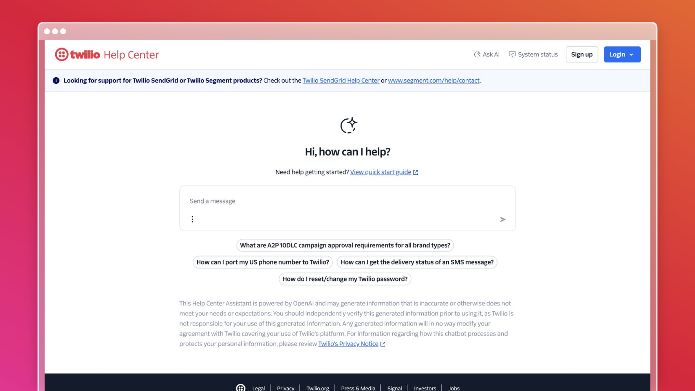
Why it works
- It converts technical capability into practical, usable workflows.
- Readers find both the how and the why in the same journey.
- Content supports real implementation instead of stopping at feature descriptions.
What you should steal
- Organize collections around common use cases, not product modules.
- Lead with code-led examples where readers need proof a workflow actually works.
- Make next steps explicit so readers move forward without backtracking.
Best fit and watchouts
- Best for developer tools, platforms, and technical onboarding flows.
- Useful when most of your ticket volume comes from setup friction.
- Less transferable if your users are non-technical and need simpler paths.
4. Airbnb
Airbnb’s help center handles an unusually wide spread of problems, from a payment that failed to a safety issue mid-stay. It stays usable because the categories are written the way guests and hosts think, not the way Airbnb is organized internally.
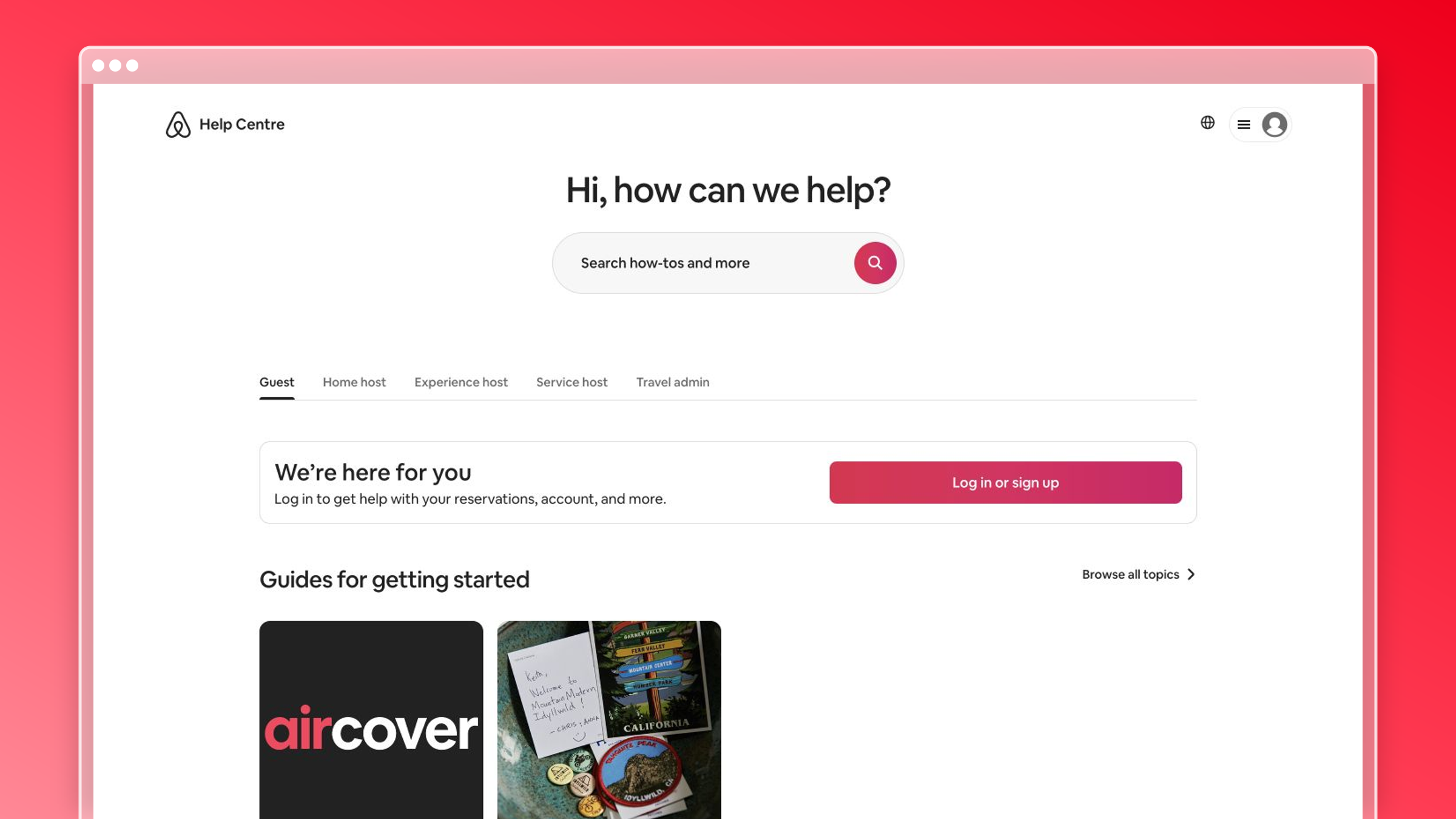
Why it works
- Self-service stays intuitive for a broad audience with very different problems.
- Structure follows user intent and recognizable scenarios.
- Paths to human support feel like part of the same experience, not an escape hatch.
What you should steal
- Write category labels in the words users would actually type into search.
- Design around jobs to be done: booking, payments, account access, safety.
- Make escalation obvious the moment self-service runs out.
Best fit and watchouts
- Best for customer-facing products with high volume and mixed user types.
- Strong example of simplifying a complicated support journey.
- Do not copy the polish without the clarity underneath it.
5. Dropbox
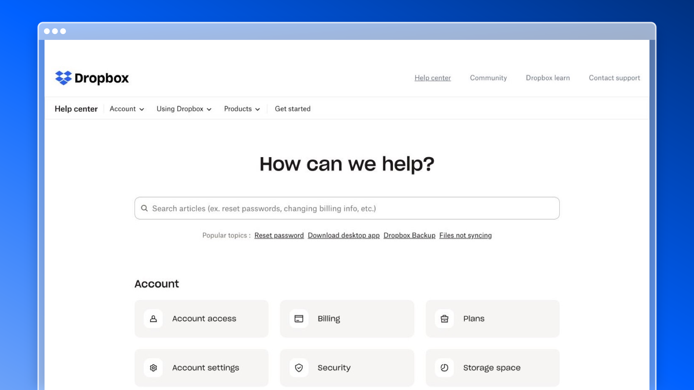
Dropbox serves individuals on an $11.99/month plan and admins running team deployments from the same help center. Its structure is a good study in segmenting without cluttering.
Why it works
- Multiple audiences coexist without the knowledge base feeling crowded.
- The structure covers everyday tasks, troubleshooting, and account-level questions.
- Support content stays accessible even though the product serves people and teams.
What you should steal
- Segment content by user type or context when needs genuinely diverge.
- Keep article titles literal and searchable instead of clever.
- Use simple numbered steps so readers scan a fix in seconds.
Best fit and watchouts
- Best for products serving both end users and admins.
- Useful when content spans setup, sharing, permissions, and troubleshooting.
- Watch for category sprawl as the product surface grows.
6. Amazon Web Services (AWS)
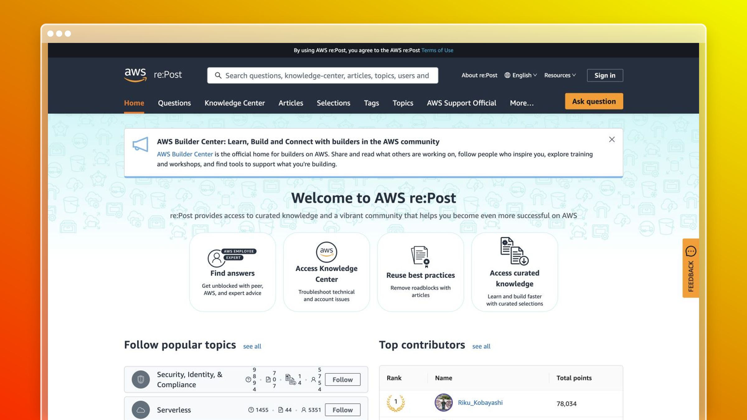
AWS documentation is enormous, and that is exactly why it belongs here. It proves a documentation set can stay navigable at a scale where search alone stops being enough.
Why it works
- Disciplined hierarchy keeps a massive documentation set findable.
- Breadcrumbs, service-level hubs, and deep reference layers let readers orient themselves.
- Its strength is scale management, not minimalism.
What you should steal
- Use consistent page patterns across categories so users learn the system once.
- Add layered navigation when one search bar cannot carry the load.
- Break large sets into clear hubs instead of one flat archive.
Best fit and watchouts
- Best for large suites and enterprise platforms with real technical depth.
- Useful when documentation scale is already the problem.
- Too heavy for early-stage teams with a small product surface.
7. Spotify
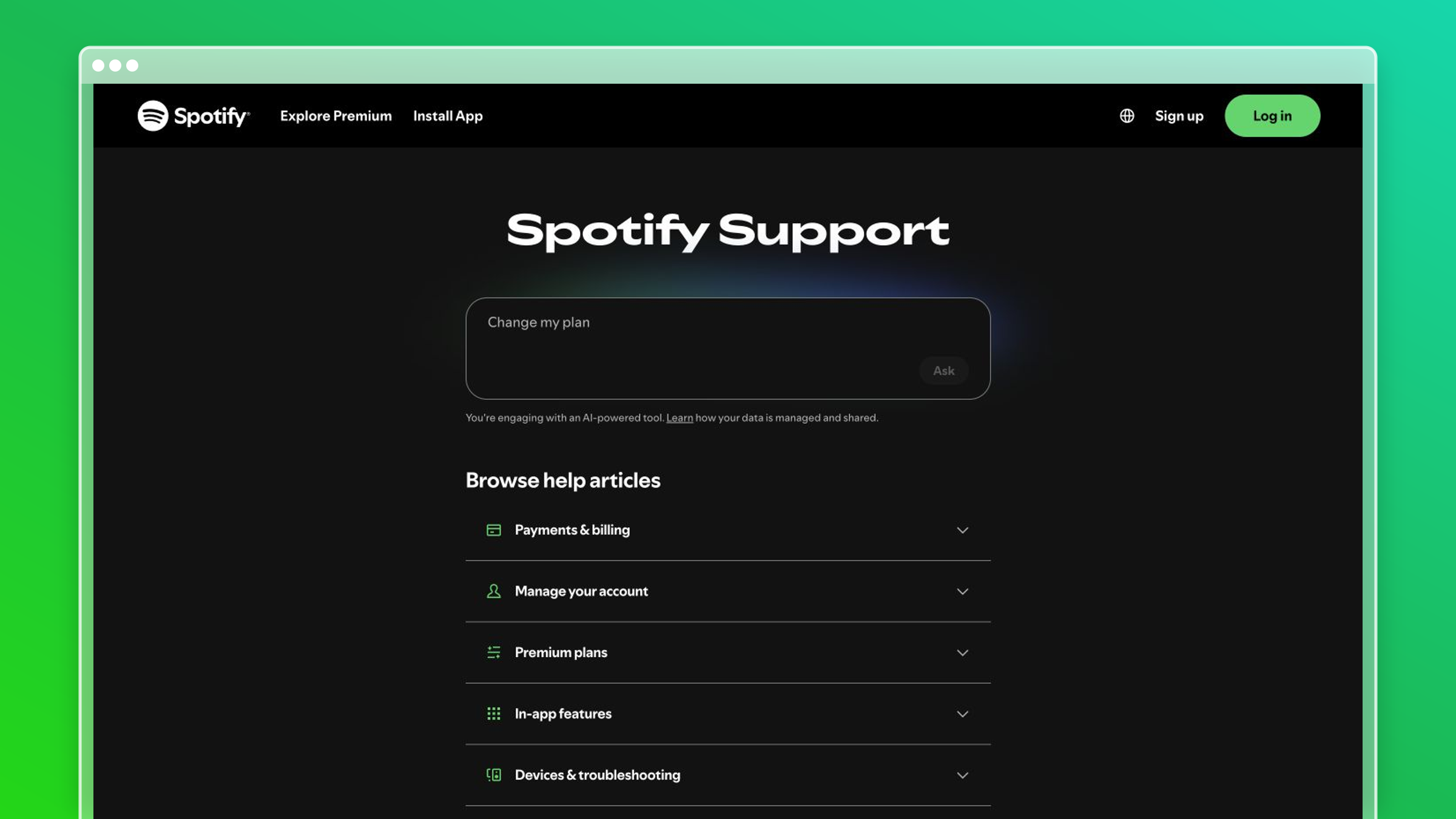
Spotify’s support content is the anti-AWS: short, plain, and built for someone who wants playback fixed in under a minute. With free and paid tiers from $6.99/month upward, most questions are account, billing, or device related, and the help center is tuned for exactly that.
Why it works
- It is a strong example of concise, plain-language support content.
- The knowledge base is optimized for quick troubleshooting, not long-form education.
- Common actions and common fixes sit near the surface.
What you should steal
- Shorten the path from homepage to answer.
- Use consumer language instead of internal product terminology.
- Prioritize the most-asked questions before building edge-case content.
Best fit and watchouts
- Best for high-volume support where speed beats depth.
- Strong model for account, billing, or device-type troubleshooting.
- Less useful if your product needs advanced configuration guidance.
8. ReadMe
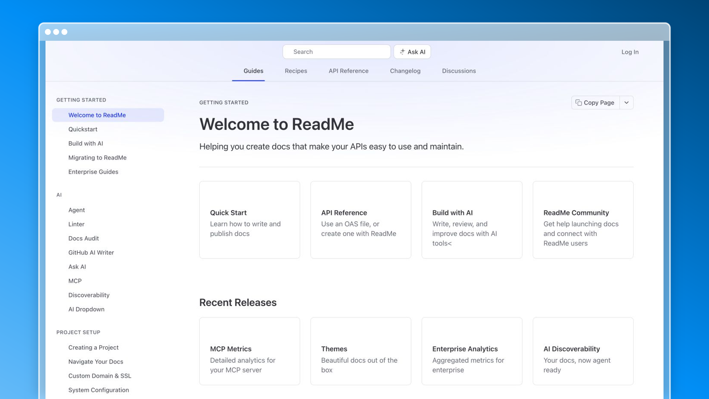
ReadMe’s own documentation demonstrates the product it sells: docs that feel designed rather than dumped. Its free Starter tier and $250/month Pro plan sit squarely in the developer-docs category, and the experience shows what deliberate docs UX buys you.
Why it works
- Documentation feels polished without sacrificing usability.
- Onboarding, reference, and developer workflow support blend into one experience.
- Docs read as part of the product, not a separate support site.
What you should steal
- Treat docs as a product surface with deliberate UX decisions.
- Make jumping between getting started and deep reference effortless.
- Use cleaner layouts to reduce cognitive load in technical content.
Best fit and watchouts
- Best for developer-focused teams wanting cohesive onboarding and API docs.
- Useful when docs drive product adoption directly.
- Do not over-index on polish if your maintenance process is weak.
9. Shopify
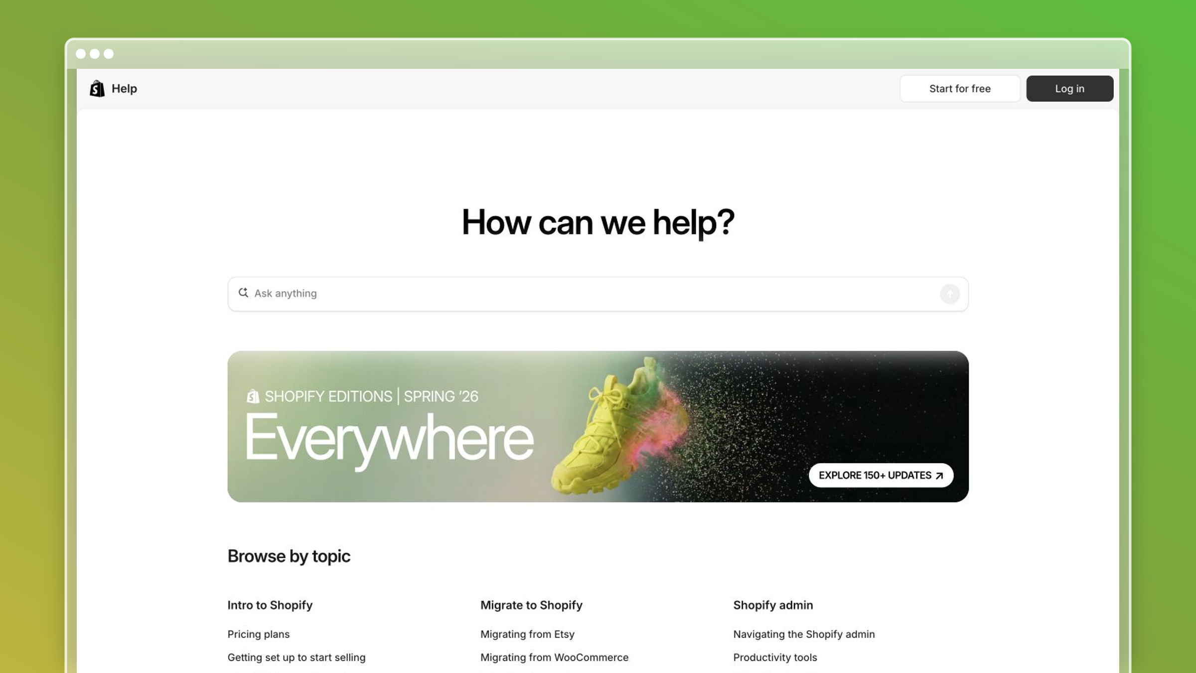
Shopify’s help center is one of the strongest ecommerce knowledge base examples available. It serves merchants at every stage, from someone setting up their first store to an operator running multi-currency, multi-location inventory. The content is organized around what merchants are trying to accomplish, not around Shopify’s internal product teams or feature names.
Why it works
- Every article title is a task: “Add a product,” “Set up shipping rates,” “Connect a custom domain.” Merchants know immediately whether they are in the right place.
- The knowledge base scales from beginner to advanced without splitting into separate portals. Filters and related-article links do the routing.
- Shopify updates docs in sync with platform releases, which matters because merchants notice stale steps faster than most SaaS users do. Their livelihood depends on the instructions being correct.
What you should steal
- Write article titles as the action the user is trying to complete, not the feature name.
- Use related-article links at the bottom of every page to extend the journey without cluttering the main content.
- Keep steps numbered and short. Shopify rarely buries a step inside a paragraph.
Best fit and watchouts
- Best for ecommerce platforms, marketplaces, and tools where users are running a business and need answers fast.
- Strong model when your product has a wide feature surface but most users only touch a slice of it.
- Do not copy the breadth without the maintenance process behind it. Shopify has dedicated documentation teams. If you do not, use automated staleness detection to compensate.
10. Sonos
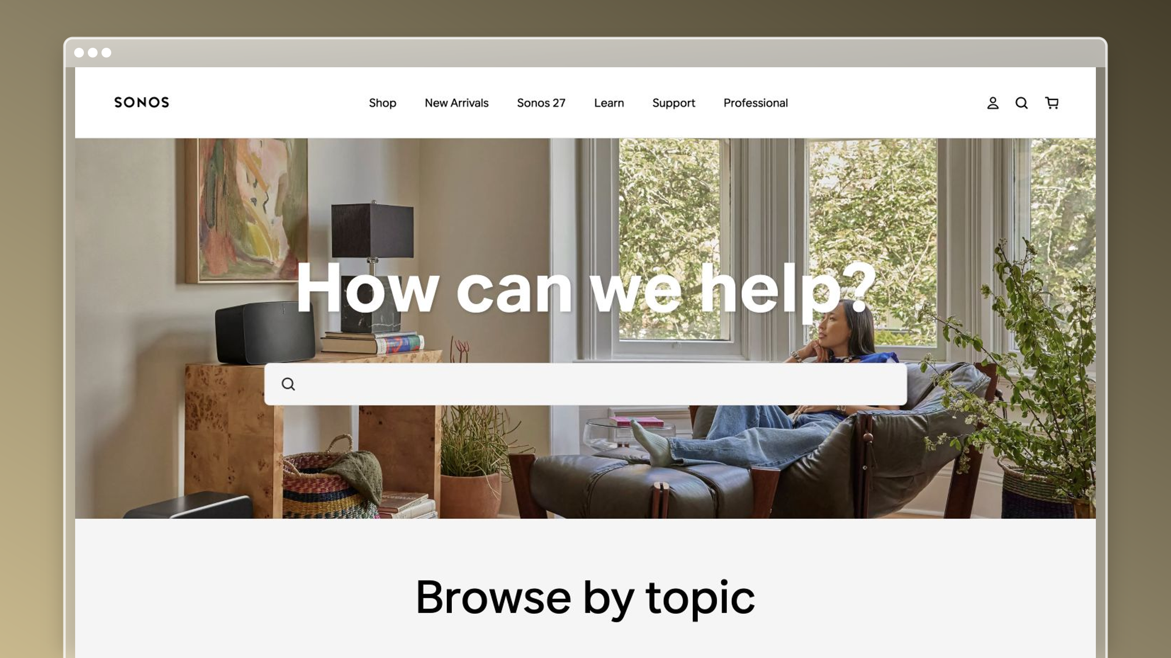
Sonos makes wireless speakers and home audio systems, and its help center is one of the better hardware knowledge base examples in the consumer space. The challenge hardware companies face is that troubleshooting steps differ by device model, firmware version, and network environment. Sonos handles this by asking users to identify their product before showing steps, which eliminates the most common failure mode in hardware docs: instructions that apply to a different model than the one the reader owns.
Why it works
- Device-aware filtering means readers never follow steps meant for a different product. This alone cuts a significant share of “that didn’t work” tickets.
- Troubleshooting articles follow a consistent symptom-first structure: what you are experiencing, what causes it, and the fix in order of likelihood.
- Setup guides use numbered steps with clear visuals, which matters when the reader is standing in their living room holding a speaker, not sitting at a desk.
What you should steal
- Add a product or plan selector at the top of troubleshooting articles when steps differ by configuration.
- Lead troubleshooting content with the symptom the user experiences, not the technical cause.
- Design for the physical context of use. If your users are on mobile or away from a desk, shorten steps and increase visual weight.
Best fit and watchouts
- Best for hardware companies, IoT products, and any software with meaningful version or configuration differences.
- Useful when your support tickets cluster around setup failures and device-specific errors.
- Watch for documentation drift when firmware updates change behavior. This is exactly the kind of silent breakage that automated screenshot and content audits catch before customers do.
11. Duolingo
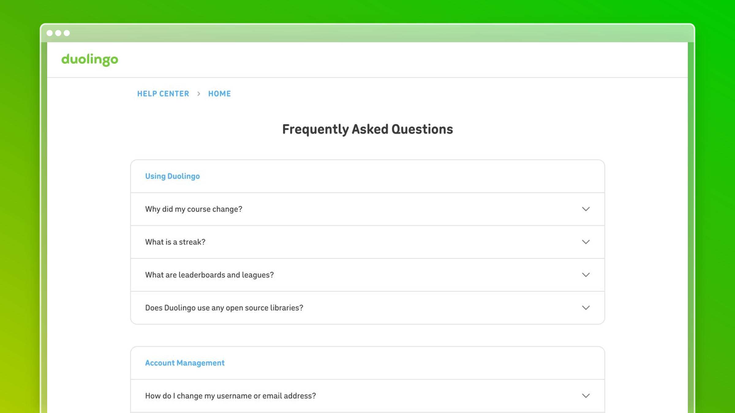
Duolingo’s help center is an education knowledge base example that most support teams overlook because the product looks simple. It is not. Duolingo manages subscription billing, streak recovery, family plan access, and learning-path logic across dozens of languages and platforms. Its help center handles all of it while keeping the same friendly, low-pressure tone the product is known for.
Why it works
- The tone matches the product. Duolingo’s help content does not suddenly become formal and corporate the moment a user hits a billing problem. That consistency reduces friction at the moment users are most likely to churn.
- Categories map to emotional states as much as functional ones: “I lost my streak,” “My subscription isn’t working,” “I want to change my language.” These are the words users actually type.
- Articles are short by design. Duolingo’s users are on mobile, often mid-session, and need a fix in under two minutes.
What you should steal
- Audit your help center tone against your product tone. If your app is casual and your docs read like a legal brief, that gap creates unnecessary friction.
- Write category labels that reflect how users feel about the problem, not how your team categorizes tickets internally.
- Optimize article length for the device and context where most users will read it. Mobile-first products need mobile-first docs.
Best fit and watchouts
- Best for consumer apps with strong brand voice and high mobile usage.
- Strong model for subscription products where billing and account questions dominate support volume.
- Tone-matching only works if the product voice is consistent to begin with. If your brand voice is still undefined, fix that first.
12. ShipBob
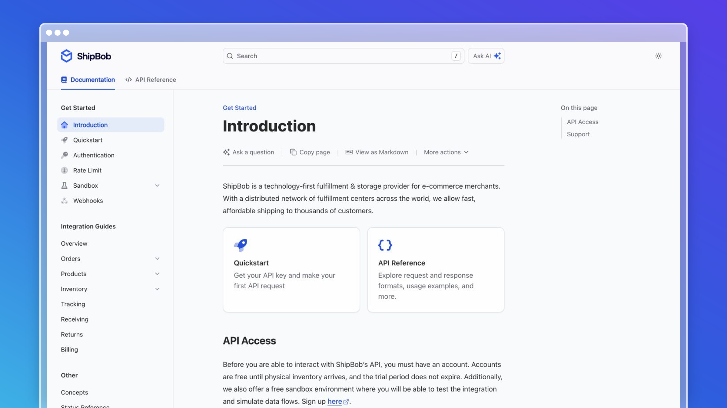
ShipBob is a third-party logistics provider, and its knowledge base is one of the most operationally dense help center examples on this list. Merchants using ShipBob are managing inventory, warehouse locations, shipping rules, returns, and integrations with Shopify, WooCommerce, and other platforms. The documentation has to cover all of it accurately, because a wrong step in a fulfillment workflow costs real money.
Why it works
- ShipBob documents the end-to-end process, not just the UI. Articles explain why a step matters in the fulfillment workflow, not just where to click. That context prevents the “I followed the steps but it still broke” ticket.
- Integration-specific guides are separated from core platform docs, so a merchant connecting Shopify does not wade through WooCommerce content to find their answer.
- The knowledge base treats merchants as operators, not consumers. Articles assume business context and skip over-explanation of basic concepts.
What you should steal
- Document the business process, not just the button sequence. Users who understand why a step exists make fewer errors downstream.
- Separate integration-specific content into its own section so users only see what is relevant to their stack.
- Write for the user’s business context. A logistics operator needs different framing than a consumer app user.
Best fit and watchouts
- Best for B2B platforms, operations tools, and any product where mistakes have financial consequences.
- Strong model when your users are running a business process through your product, not just using a feature.
- Operational depth requires operational maintenance. When your platform changes a fulfillment rule or adds a warehouse region, docs must update immediately. Automated monitoring of changelogs and release notes is not optional at this depth.
13. Notion
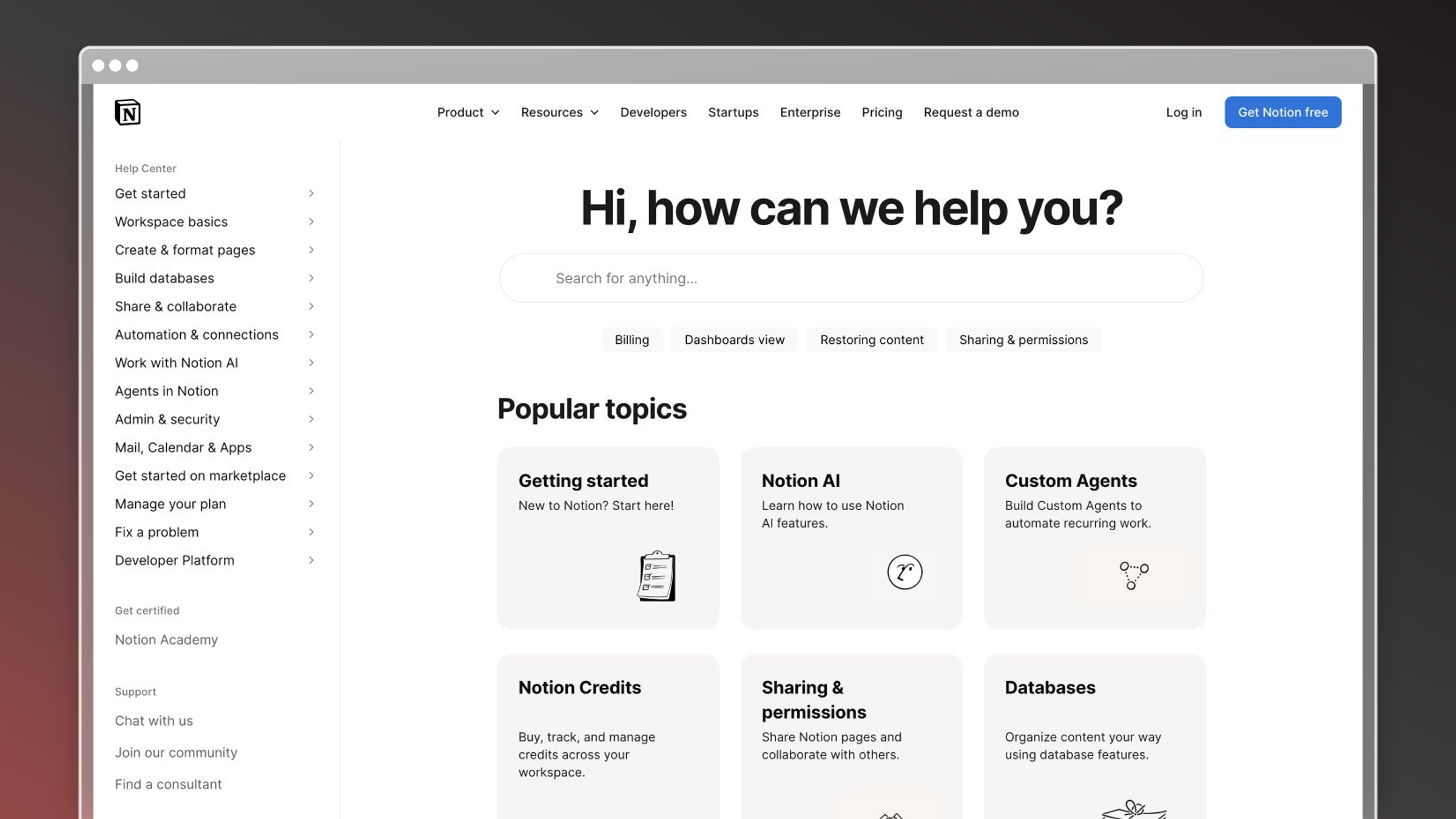
Notion’s help center is interesting because the product is infinitely flexible, which makes documentation genuinely hard. How do you write a knowledge base for a tool that every user configures differently? Notion’s answer is to document the building blocks clearly and then point users toward a community of templates and use-case guides that extend the official docs.
Why it works
- Official docs cover core concepts and features with precision. Community templates and guides handle the “how do I use this for my specific workflow” questions that official docs cannot anticipate.
- The help center search is strong enough to surface both official articles and linked community resources, so users get a useful answer regardless of how specific their question is.
- Notion treats its power users as documentation contributors, which scales content creation without scaling headcount.
What you should steal
- Link official docs to community-created templates and guides where your product supports open-ended workflows.
- Document the primitives well. If users understand the building blocks, they can figure out the combinations themselves.
- Invest in search quality over navigation depth when your product surface is wide and user configurations vary.
Best fit and watchouts
- Best for flexible, horizontal tools where use cases vary widely by team and industry.
- Useful when you have an active user community willing to create supplementary content.
- Community-extended docs require curation. Outdated community guides that rank above official docs create confusion. Monitor what users find first, not just what you publish.
14. Figma
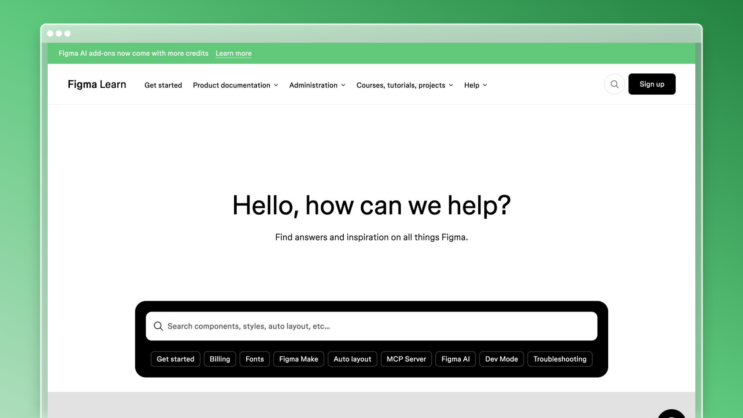
Figma’s help center is a strong example of documentation built for a visual, spatial product. Design tools present a specific documentation challenge: many workflows are easier to show than describe. Figma leans into this with embedded video walkthroughs, annotated GIFs, and short clips that demonstrate interactions that would take three paragraphs to explain in text.
Why it works
- Video and visual content appear where they reduce ambiguity, not as decoration. A clip showing how to use Auto Layout communicates in ten seconds what a numbered list cannot.
- Articles are structured so text-first readers and visual-first readers both get what they need. The written steps are complete; the video is supplementary, not required.
- Figma keeps its help center current with product releases, which matters because design tool UI changes frequently and outdated screenshots actively mislead users.
What you should steal
- Use short video clips or annotated GIFs for workflows that involve spatial interaction, drag-and-drop, or multi-step UI sequences.
- Keep written steps complete even when video is present. Not every user can watch video in their current context.
- Treat screenshots as a maintenance liability. Every UI change that goes undocumented is a future support ticket. Automated screenshot refresh, the kind Ferndesk handles when UI changes are detected, removes this from your manual checklist.
Best fit and watchouts
- Best for design tools, creative software, and any product where the interface itself is the primary learning surface.
- Strong model when your users learn by doing and find text-only instructions frustrating.
- Video content ages faster than text. A product update that changes a modal or renames a panel makes every related video misleading. Build a process for flagging and re-recording before you invest heavily in video.
15. HubSpot
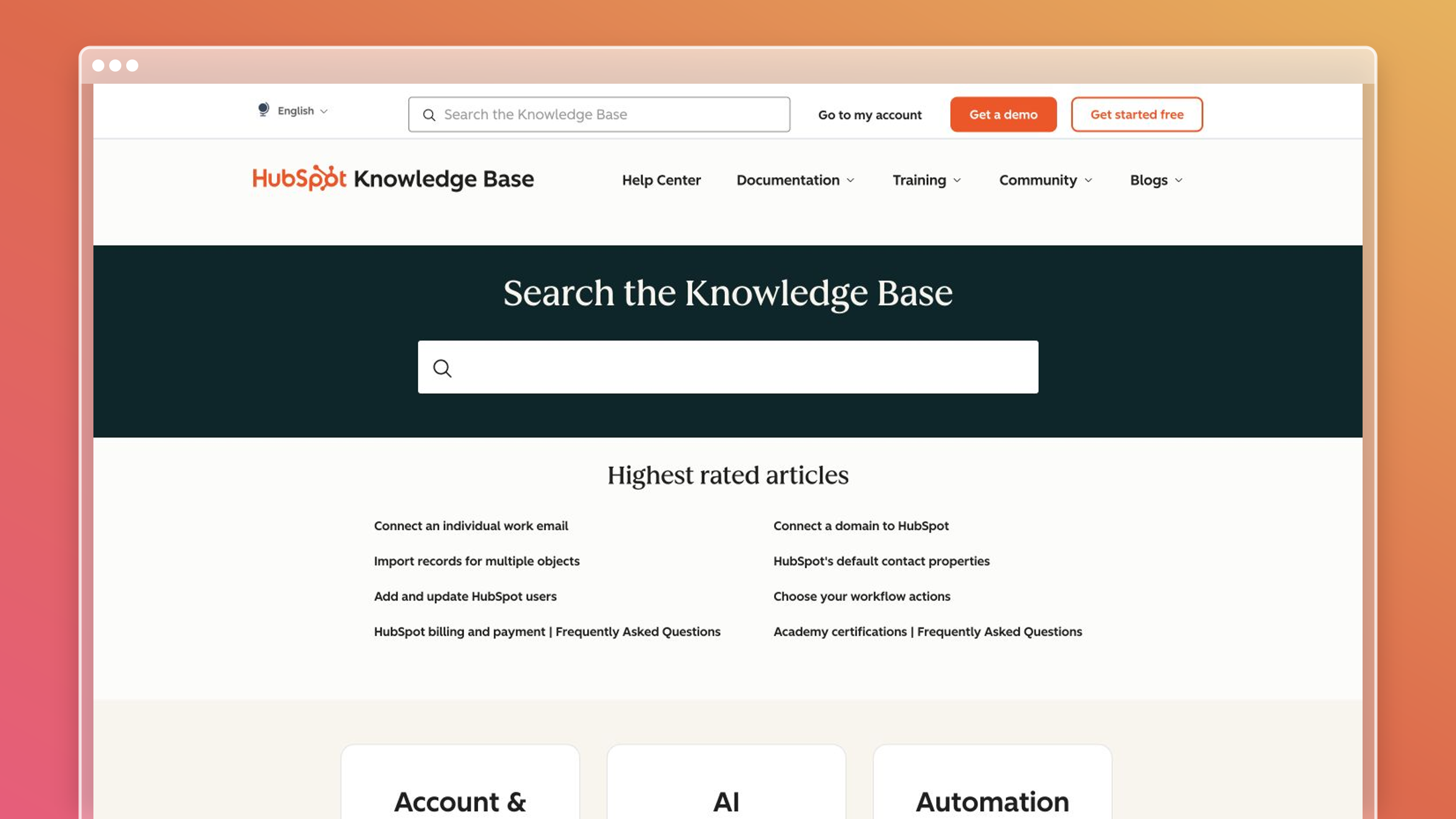
HubSpot’s Knowledge Base is one of the most comprehensive examples of role-based documentation in the CRM and marketing software category. The platform serves marketers, salespeople, service teams, and admins, and the help center reflects that by routing users toward content relevant to their role before they start browsing.
Why it works
- Role-based entry points reduce the time users spend filtering out irrelevant content. A sales rep and a marketing manager have almost no overlapping questions, and HubSpot’s structure reflects that.
- The knowledge base connects directly to HubSpot Academy, so users who want to go deeper than a help article can move into structured learning without leaving the ecosystem.
- Article quality is consistently high because HubSpot treats documentation as a product investment, not a support cost. That framing shows in the depth and accuracy of individual articles.
What you should steal
- Build separate entry paths for each distinct user persona when their workflows and questions do not overlap.
- Connect help articles to deeper learning resources for users who want more than a quick fix.
- Treat documentation as a product investment with named owners, review cycles, and quality standards, not as a reactive support task.
Best fit and watchouts
- Best for multi-persona SaaS products where different user roles have genuinely different workflows and questions.
- Strong model when your product spans multiple hubs or modules that different teams own.
- Role-based navigation adds structural complexity. Do not build it until you have enough content per persona to justify the split. A thin persona section is worse than a flat structure.
Internal knowledge base examples: what changes when the audience is your team
Internal docs fail differently. Nobody files a ticket about a stale runbook; onboarding just quietly takes three weeks longer than it should.
Two internal examples worth copying
- An agent-facing answer library inside the ticket queue, so reps never leave the workflow.
- A new-hire onboarding hub with a dated path: week one setup, week two shadowing, week three first solo tickets.
- Tool choice follows scale: Confluence or SharePoint for enterprise teams needing security and integration depth, Notion or Slab for mid-market teams focused on collaboration. Evaluate all of them on search quality, access control, and analytics.
- Every internal article carries a named owner and a visible last-reviewed date.
Which habits from the external examples transfer
- Spotify’s plain language works internally too: write the fix, skip the theory.
- AWS-style consistent page patterns make internal search predictable.
- Airbnb-style intent labels beat department names as categories.
How to build a knowledge base from these examples in 30 days
You do not need a redesign. You need one model, ten articles, and a maintenance loop that survives your next release. Here is the sequence that gets you from zero to a working knowledge base without overbuilding.
Step 1: Pick your model
Match the structure to your product type before writing a single article.
- API or developer tool: the Stripe and Twilio split between guides and reference.
- Consumer or high-volume support: the Spotify and Airbnb short-path model.
- Multi-audience or enterprise: the Dropbox and AWS hub structure.
- Pick one. Mixing three navigation systems is how category sprawl begins.
Step 2: Audit what you already have
Before writing anything new, take stock of existing content so you do not duplicate or contradict it.
- List every existing article, doc, or FAQ in a spreadsheet with its URL and last-updated date.
- Flag anything more than six months old or tied to a UI that has since changed.
- Archive or delete content that no longer reflects the product. Stale articles hurt search and confuse customers.
Step 3: Set your taxonomy before you write
Structure follows user intent, not your org chart. Define your top-level categories using the words customers actually search.
- Pull your top search queries from your current help center or site search analytics.
- Group them into five to eight categories maximum. More than that and navigation becomes a problem.
- Name categories after jobs to be done, such as getting started, billing, account access, and troubleshooting, not after internal teams or product modules.
Step 4: Choose your first 10 articles from ticket data
Let ticket data pick your backlog instead of your intuition.
- Export top ticket reasons from the last 90 days and cluster them by question, not by team.
- Write the top 10 as article titles using the exact words customers used.
- Ship rough versions fast, then improve the ones getting views but no resolution.
- Skip edge cases until the top 10 stop generating tickets.
Step 5: Choose a template and apply it consistently
Consistent page patterns reduce cognitive load and make your knowledge base feel like a system rather than a collection of one-off docs.
- Pick one article template for how-to content: title, one-sentence summary, numbered steps, and a next-step link.
- Pick a second template for troubleshooting: symptom, cause, fix, and escalation path.
- Apply both templates to your first 10 articles before expanding the library.
Step 6: Set the maintenance loop before launch
A knowledge base without a maintenance process is a countdown to stale content.
- Assign one named owner per article, not one owner for the entire knowledge base.
- Tie reviews to release cadence so shipping a feature triggers a docs check.
- Review failed searches and thumbs-down feedback weekly.
- Connect Ferndesk to GitHub and your ticketing tool so changed flows and outdated screenshots get flagged automatically.
Launch checklist
- Taxonomy defined with five to eight intent-based categories.
- First 10 articles published using consistent templates.
- Search bar prominent on the homepage.
- Feedback mechanism active on every article.
- Named owner assigned to each article.
- Maintenance trigger set for every product release.
- Failed search tracking enabled.
Three KPIs to track from week one
- Failed searches per week: the number of queries that return no result. This is your content gap list.
- Self-service resolution rate: the share of help center visits that end without a ticket. Aim to move this number up each month.
- Article views with no positive feedback: articles getting traffic but thumbs-down or no rating signal content that needs rewriting, not just more promotion.
Which of the best knowledge base examples should you copy?
Stop ranking these and start matching them. Your product type decides the structure, your ticket data decides the content, and your release cadence decides how much maintenance automation you need.
- AI-native maintenance: Ferndesk, if docs break every time you ship.
- Developer docs: Stripe, Twilio, and ReadMe for guides, reference, and docs UX.
- Consumer self-service: Spotify and Airbnb for short paths and intent-based labels.
- Large-scale documentation: AWS and Dropbox for hubs and audience segmentation.
- Ecommerce and merchant tools: Shopify for task-first article structure and related-article linking.
- Hardware and IoT products: Sonos for device-aware filtering and symptom-first troubleshooting.
- Education and consumer apps: Duolingo for tone-matched, mobile-optimized support content.
- Logistics and operations platforms: ShipBob for process-depth documentation that goes beyond the UI.
- Flexible, horizontal tools: Notion for primitive-first docs extended by community content.
- Visual and design tools: Figma for video-first explanations of spatial workflows.
- Multi-persona SaaS: HubSpot for role-based entry paths and docs-as-product-investment framing.
The best knowledge base example is the one your team can keep accurate as the product changes.
FAQs about the best knowledge base examples
What makes a knowledge base example worth copying?
Fast prominent search, structure built on user intent, plain language, visuals only where tasks are complex, working feedback loops, and evidence that content is maintained. Design comes last.
How many articles should a new knowledge base launch with?
Ten, drawn from your top ticket reasons over the last 90 days. Depth added before demand is measured is usually wasted.
Should internal and customer-facing knowledge bases live in the same tool?
Only if the tool supports authentication and role-based permissions. Private help centers with SSO, OIDC, or magic links let you run both without leaking internal notes.
How often should knowledge base content be reviewed?
Tie reviews to your release cadence rather than the calendar. Weekly automated audits plus a docs check on every feature ship catches most drift before customers do.
Why do help centers go stale so quickly?
Because teams ship faster than they write. Screenshots, UI labels, and step order break silently, and nobody notices until the tickets arrive.
Do knowledge bases still matter now that AI assistants answer questions?
More than before. Assistants answer from your published content, so clean structure, sitemaps, and llms.txt determine whether the answer people get is accurate or two versions out of date.


 Book a demo