
A few months ago, I launched a help widget for Ferndesk that lets you embed your help center directly in your product. You can play around with it on the bottom right of this screen!
I’ve built a lot of widgets over the years. At my last company Senja we shipped dozens of widgets that are viewed millions of times per month, so I had opinions on how to do this right.
So here’s everything I know about building embeddable widgets with Svelte.
In this tutorial, we’ll build a feedback widget from scratch. The kind you see on SaaS products that lets users submit bug reports or feature requests. By the end, you’ll have a single JavaScript file that anyone can embed with one script tag.
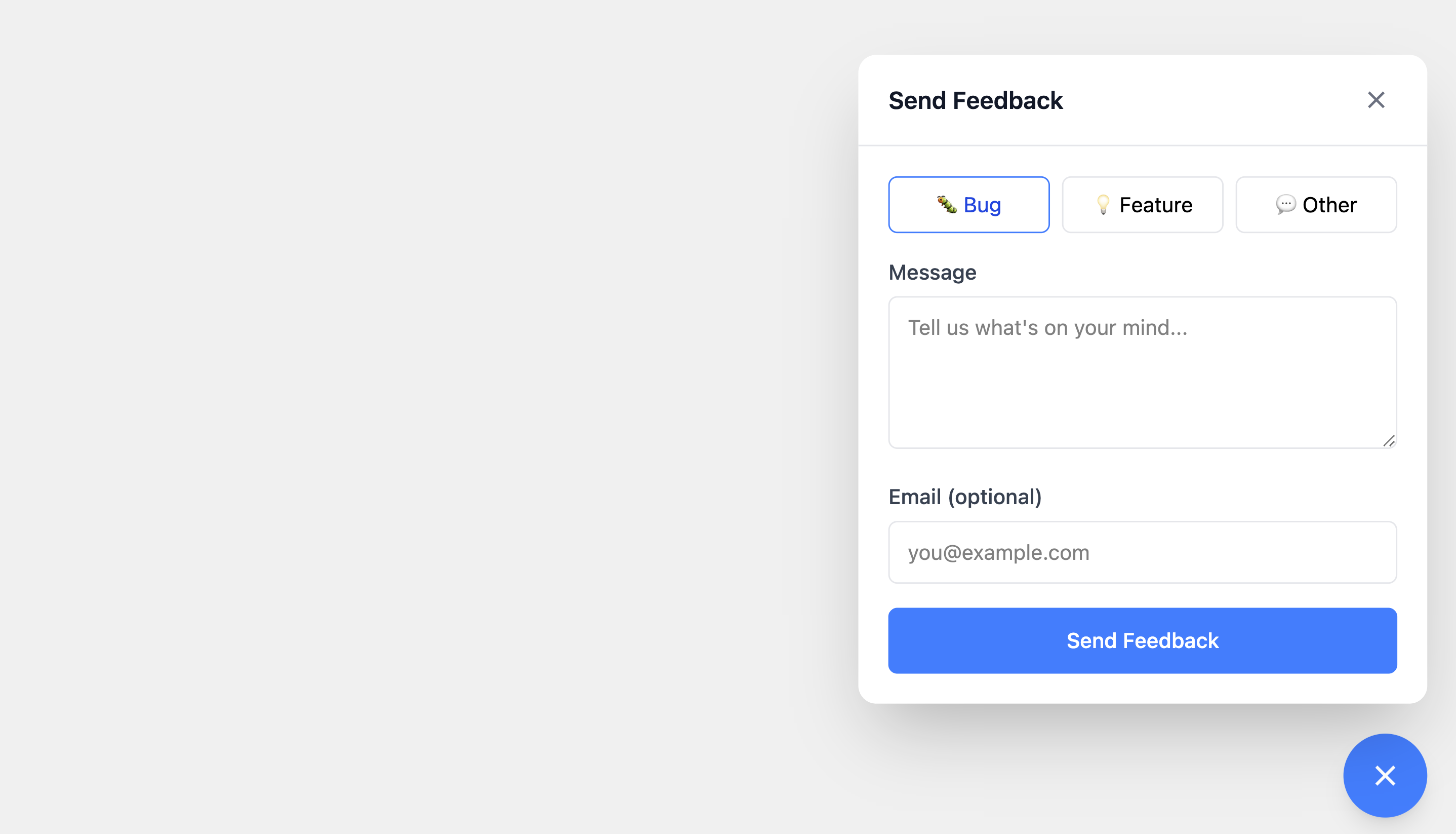
Here’s what we’re building:
<!-- This is all your users need -->
<script src="https://cdn.example.com/widget.js"></script>
<script>
	FeedbackWidget('init', { widgetId: 'wgt_abc123' });
</script>
The widgetId identifies the widget configuration to load from your backend: branding colors, which features are enabled, where to send submissions, etc.
The widget will:
- Float in the corner of any website
- Open a form when clicked
- Submit feedback to an API
- Never conflict with the host page’s styles
Let’s build it.
Why Svelte for Embeddable Widgets?
When you’re building an embeddable widget, every kilobyte matters. Unlike a traditional SPA where users expect a loading spinner, widget users expect instant availability. This constraint eliminates most frameworks immediately.
The Virtual DOM Tax
React, Vue, and similar frameworks ship a virtual DOM diffing engine. This abstraction is powerful for complex applications but adds 40-50KB minimum to your bundle. When your widget needs to load alongside dozens of other scripts on a marketing page, this overhead is unacceptable.
Svelte compiles your components to imperative DOM operations at build time. There’s no runtime diffing. The compiler generates exactly the code needed to update the DOM when state changes.
<script>
	let count = $state(0);
</script>

<button onclick={() => count++}>
	Clicked {count} times
</button>
This compiles to something like:
let count = 0;
const button = document.createElement('button');
const text = document.createTextNode(`Clicked ${count} times`);
button.appendChild(text);
button.addEventListener('click', () => {
	count++;
	text.nodeValue = `Clicked ${count} times`;
});
No virtual DOM. No reconciliation. Just direct DOM manipulation. The Svelte runtime that does ship is minimal: transition helpers and reactivity utilities.
Svelte 5 Runes
Svelte 5 introduced runes, a new reactivity system that’s both more explicit and more efficient. The $state and $props runes replace the old reactive declarations:
<script lang="ts">
	// Props are explicit
	interface Props {
		widgetId: string;
		onClose?: () => void;
	}
	let { widgetId, onClose }: Props = $props();

	// State is explicit
	let isOpen = $state(false);
	let messages = $state<Message[]>([]);

	// Derived values
	let messageCount = $derived(messages.length);
</script>
This explicitness makes components easier to reason about and enables better dead code elimination during bundling.
The Stack
Here’s what we use and why:
| Tool | Purpose | Why Not Alternatives |
|---|---|---|
| Svelte 5 | UI framework | Compiles away, tiny runtime |
| Rolldown | Production bundler | Faster than Rollup, better tree-shaking than esbuild |
| Tailwind CSS | Styling | Atomic classes = smaller CSS after purging |
| Shadow DOM | Style isolation | Native browser API, no runtime cost |
Why Rolldown Over Vite?
Vite uses Rollup under the hood, so why not just use Vite?
Vite is designed for applications—it gives you a dev server, hot module replacement, and code splitting. For widgets, you don’t want any of that. You want a single IIFE file with everything inlined.
You can configure Vite for this (build.lib mode with formats: ['iife']), but you’re fighting against its defaults. Using Rolldown directly gives you:
- IIFE output by default: No module system, just a single
<script>tag - Full control over CSS: Inline everything, no external stylesheets
- Simpler plugin wiring: No abstraction layer between you and the bundler
Why Tailwind?
Tailwind seems counterintuitive for widgets. Won’t it bloat the bundle with unused utilities?
The opposite. Tailwind’s atomic classes mean:
- Aggressive purging: Only classes you use are included
- High compression: Repeated class names compress extremely well with gzip
- No specificity wars: Utility classes don’t fight with host page styles
- Rapid development: No context-switching to CSS files
A typical widget’s Tailwind CSS compresses to 8-15KB gzipped, smaller than most hand-written CSS.
Embedding Strategies
There are two main approaches for embedding widgets:
iframes
<iframe src="https://widget.example.com" width="400" height="600"></iframe>Pros:
- Complete isolation (styles, JavaScript, even crashes)
- Simple to implement
- Works everywhere
Cons:
- Separate network request for iframe content
- Communication requires
postMessage - Fixed dimensions are awkward
- Feels “embedded” rather than native
Shadow DOM (What We’ll Use)
const container = document.createElement('div');
const shadow = container.attachShadow({ mode: 'open' });
// Mount your app inside shadow
Pros:
- Single script, no additional requests
- Native-feeling integration
- Full access to host page context when needed
- Flexible sizing and positioning
Cons:
- More complex CSS handling (we’ll solve this)
- Must be careful about global state
For most widgets (feedback forms, chat bubbles, help centers) Shadow DOM is the right choice. It loads faster and feels more integrated. iframes make sense when you need bulletproof isolation (payment forms, third-party auth).
Now let’s build it.
Prerequisites
You’ll need:
- Node.js 18+ or Bun
- Basic familiarity with Svelte
Step 1: Project Setup
Create a new directory and initialize the project:
mkdir feedback-widget && cd feedback-widget
bun init -y
Install dependencies:
bun add svelte
bun add -d rolldown rollup-plugin-svelte @rollup/plugin-replace @rollup/plugin-terser postcss tailwindcss @tailwindcss/postcss autoprefixer cssnano
Create the project structure:
mkdir -p src/components scripts
touch src/sdk.ts src/Widget.svelte src/components/FeedbackForm.svelte src/widget.css src/types.d.ts scripts/build.ts
Your structure should look like:
feedback-widget/
├── src/
│   ├── sdk.ts              # Entry point, handles embedding
│   ├── Widget.svelte       # Main widget component
│   ├── widget.css          # Tailwind styles
│   ├── types.d.ts          # Type declarations
│   └── components/
│       └── FeedbackForm.svelte
├── scripts/
│   └── build.ts            # Build script
└── package.json
Step 2: The Widget Component
Let’s start with the Svelte components. First, the main widget shell:
<!-- src/Widget.svelte -->
<script lang="ts">
	import { fly } from 'svelte/transition';
	import FeedbackForm from './components/FeedbackForm.svelte';

	interface Props {
		widgetId: string;
	}

	let { widgetId }: Props = $props();

	let isOpen = $state(false);

	export function open() {
		isOpen = true;
	}

	export function close() {
		isOpen = false;
	}

	export function toggle() {
		isOpen = !isOpen;
	}
</script>

<!-- Trigger Button -->
<button
	type="button"
	class="fixed right-5 bottom-5 z-999999 flex h-14 w-14 cursor-pointer items-center justify-center rounded-full border-none bg-blue-500 text-white shadow-lg transition-all hover:scale-105 hover:bg-blue-600"
	onclick={() => (isOpen = !isOpen)}
	aria-label="Open feedback form"
>
	{#if isOpen}
		<svg
			xmlns="http://www.w3.org/2000/svg"
			width="24"
			height="24"
			viewBox="0 0 24 24"
			fill="none"
			stroke="currentColor"
			stroke-width="2"
		>
			<line x1="18" y1="6" x2="6" y2="18"></line>
			<line x1="6" y1="6" x2="18" y2="18"></line>
		</svg>
	{:else}
		<svg
			xmlns="http://www.w3.org/2000/svg"
			width="24"
			height="24"
			viewBox="0 0 24 24"
			fill="none"
			stroke="currentColor"
			stroke-width="2"
		>
			<path d="M21 15a2 2 0 0 1-2 2H7l-4 4V5a2 2 0 0 1 2-2h14a2 2 0 0 1 2 2z"></path>
		</svg>
	{/if}
</button>

<!-- Feedback Panel -->
{#if isOpen}
	<div
		class="fixed right-5 bottom-24 z-999999 max-h-125 w-95 overflow-hidden rounded-xl bg-white shadow-2xl"
		transition:fly={{ y: 10, duration: 200 }}
	>
		<div class="flex items-center justify-between border-b border-gray-200 px-5 py-4">
			<h2 class="text-base font-semibold text-gray-900">Send Feedback</h2>
			<button
				type="button"
				onclick={() => (isOpen = false)}
				class="flex cursor-pointer items-center justify-center rounded p-1 text-gray-500 hover:bg-gray-100 hover:text-gray-900"
				aria-label="Close"
			>
				<svg
					xmlns="http://www.w3.org/2000/svg"
					width="20"
					height="20"
					viewBox="0 0 24 24"
					fill="none"
					stroke="currentColor"
					stroke-width="2"
				>
					<line x1="18" y1="6" x2="6" y2="18"></line>
					<line x1="6" y1="6" x2="18" y2="18"></line>
				</svg>
			</button>
		</div>

		<FeedbackForm {widgetId} onSuccess={() => (isOpen = false)} />
	</div>
{/if}
Now the feedback form component:
<!-- src/components/FeedbackForm.svelte -->
<script lang="ts">
	interface Props {
		widgetId: string;
		onSuccess: () => void;
	}

	let { widgetId, onSuccess }: Props = $props();

	let feedbackType = $state<'bug' | 'feature' | 'other'>('bug');
	let message = $state('');
	let email = $state('');
	let isSubmitting = $state(false);
	let error = $state<string | null>(null);
	let success = $state(false);

	async function handleSubmit(e: Event) {
		e.preventDefault();

		if (!message.trim()) {
			error = 'Please enter a message';
			return;
		}

		isSubmitting = true;
		error = null;

		try {
			const response = await fetch('https://api.example.com/feedback', {
				method: 'POST',
				headers: { 'Content-Type': 'application/json' },
				body: JSON.stringify({
					widgetId,
					type: feedbackType,
					message: message.trim(),
					email: email.trim() || null,
					url: window.location.href,
					userAgent: navigator.userAgent
				})
			});

			if (!response.ok) {
				throw new Error('Failed to submit feedback');
			}

			success = true;
			setTimeout(() => {
				onSuccess();
				message = '';
				email = '';
				success = false;
			}, 1500);
		} catch (err) {
			error = err instanceof Error ? err.message : 'Something went wrong';
		} finally {
			isSubmitting = false;
		}
	}
</script>

<form onsubmit={handleSubmit} class="p-5">
	{#if success}
		<div class="px-5 py-10 text-center text-emerald-600">
			<svg
				xmlns="http://www.w3.org/2000/svg"
				width="48"
				height="48"
				viewBox="0 0 24 24"
				fill="none"
				stroke="currentColor"
				stroke-width="2"
				class="mx-auto"
			>
				<path d="M22 11.08V12a10 10 0 1 1-5.93-9.14"></path>
				<polyline points="22 4 12 14.01 9 11.01"></polyline>
			</svg>
			<p class="mt-4 text-base font-medium">Thanks for your feedback!</p>
		</div>
	{:else}
		<!-- Feedback Type Selector -->
		<div class="mb-4 flex gap-2">
			<button
				type="button"
				class="flex-1 cursor-pointer rounded-md border bg-white px-3 py-2 text-sm transition-colors hover:border-blue-500 {feedbackType ===
				'bug'
					? 'border-blue-500 bg-blue-50 text-blue-700'
					: 'border-gray-200'}"
				onclick={() => (feedbackType = 'bug')}
			>
				🐛 Bug
			</button>
			<button
				type="button"
				class="flex-1 cursor-pointer rounded-md border bg-white px-3 py-2 text-sm transition-colors hover:border-blue-500 {feedbackType ===
				'feature'
					? 'border-blue-500 bg-blue-50 text-blue-700'
					: 'border-gray-200'}"
				onclick={() => (feedbackType = 'feature')}
			>
				💡 Feature
			</button>
			<button
				type="button"
				class="flex-1 cursor-pointer rounded-md border bg-white px-3 py-2 text-sm transition-colors hover:border-blue-500 {feedbackType ===
				'other'
					? 'border-blue-500 bg-blue-50 text-blue-700'
					: 'border-gray-200'}"
				onclick={() => (feedbackType = 'other')}
			>
				💬 Other
			</button>
		</div>

		<!-- Message Input -->
		<div class="mb-4">
			<label for="message" class="mb-1.5 block text-sm font-medium text-gray-700"> Message </label>
			<textarea
				id="message"
				bind:value={message}
				placeholder="Tell us what's on your mind..."
				rows="4"
				class="w-full resize-y rounded-md border border-gray-200 px-3 py-2.5 text-sm focus:border-blue-500 focus:outline-none"
			></textarea>
		</div>

		<!-- Email Input (Optional) -->
		<div class="mb-4">
			<label for="email" class="mb-1.5 block text-sm font-medium text-gray-700">
				Email (optional)
			</label>
			<input
				type="email"
				id="email"
				bind:value={email}
				placeholder="[email protected]"
				class="w-full rounded-md border border-gray-200 px-3 py-2.5 text-sm focus:border-blue-500 focus:outline-none"
			/>
		</div>

		{#if error}
			<div class="mb-4 rounded-md border border-red-200 bg-red-50 p-3 text-sm text-red-600">
				{error}
			</div>
		{/if}

		<button
			type="submit"
			disabled={isSubmitting}
			class="w-full cursor-pointer rounded-md bg-blue-500 py-3 text-sm font-medium text-white transition-colors hover:bg-blue-600 disabled:cursor-not-allowed disabled:opacity-60"
		>
			{#if isSubmitting}
				Sending...
			{:else}
				Send Feedback
			{/if}
		</button>
	{/if}
</form>
Step 3: The SDK Entry Point
This is where the magic happens. The SDK file handles:
- Creating a container element
- Attaching a Shadow DOM for style isolation
- Mounting the Svelte component
- Exposing a global API
// src/sdk.ts
import { mount, unmount } from 'svelte';
import Widget from './Widget.svelte';
import widgetStyles from './widget.css?inline';

// Type definitions
type Command = 'init' | 'open' | 'close' | 'toggle' | 'destroy';

interface InitOptions {
	widgetId: string; // Identifies which widget config to load from your backend
	position?: 'bottom-right' | 'bottom-left';
}

interface WidgetAPI {
	(command: 'init', options: InitOptions): void;
	(command: 'open' | 'close' | 'toggle' | 'destroy'): void;
	q?: IArguments[];
}

declare global {
	interface Window {
		FeedbackWidget: WidgetAPI;
	}
}

// Widget state
let widgetInstance: ReturnType<typeof mount> | null = null;
let containerEl: HTMLDivElement | null = null;
const CONTAINER_ID = 'feedback-widget-container';

// Host styles required for Tailwind CSS variables to work in Shadow DOM
const HOST_STYLES = `
:host {
  display: block;
  font-family: ui-sans-serif, system-ui, sans-serif, "Apple Color Emoji", "Segoe UI Emoji";
  text-align: left;
  --tw-border-style: solid;
  --tw-translate-x: 0;
  --tw-translate-y: 0;
  --tw-translate-z: 0;
  --tw-rotate-x: rotateX(0);
  --tw-rotate-y: rotateY(0);
  --tw-rotate-z: rotateZ(0);
  --tw-skew-x: skewX(0);
  --tw-skew-y: skewY(0);
  --tw-shadow: 0 0 #0000;
  --tw-inset-shadow: 0 0 #0000;
  --tw-ring-shadow: 0 0 #0000;
  --tw-inset-ring-shadow: 0 0 #0000;
  --tw-ring-offset-width: 0px;
  --tw-ring-offset-color: #fff;
  --tw-ring-offset-shadow: 0 0 #0000;
  --tw-outline-style: solid;
}
`;

function createWidget(options: InitOptions) {
	// Prevent double initialization
	if (document.getElementById(CONTAINER_ID)) {
		console.warn('[FeedbackWidget] Already initialized');
		return;
	}

	// Create container
	containerEl = document.createElement('div');
	containerEl.id = CONTAINER_ID;
	document.body.appendChild(containerEl);

	// Attach Shadow DOM
	const shadowRoot = containerEl.attachShadow({ mode: 'open' });

	// Inject styles into shadow root
	const styleEl = document.createElement('style');
	styleEl.textContent = `${HOST_STYLES}\n${widgetStyles}`;
	shadowRoot.appendChild(styleEl);

	// Create mount point
	const mountPoint = document.createElement('div');
	mountPoint.id = 'widget-mount';
	shadowRoot.appendChild(mountPoint);

	// Mount Svelte component
	widgetInstance = mount(Widget, {
		target: mountPoint,
		props: {
			widgetId: options.widgetId
		}
	});

	return widgetInstance;
}

function handleCommand(command: Command, ...args: unknown[]) {
	switch (command) {
		case 'init': {
			const options = args[0] as InitOptions;
			if (!options?.widgetId) {
				console.error('[FeedbackWidget] init requires widgetId');
				return;
			}
			createWidget(options);
			break;
		}

		case 'open':
			(widgetInstance as any)?.open?.();
			break;

		case 'close':
			(widgetInstance as any)?.close?.();
			break;

		case 'toggle':
			(widgetInstance as any)?.toggle?.();
			break;

		case 'destroy':
			if (widgetInstance) {
				unmount(widgetInstance);
				widgetInstance = null;
			}
			containerEl?.remove();
			containerEl = null;
			break;
	}
}

// Process any queued commands from the loader
function processQueue() {
	const queue = window.FeedbackWidget?.q;
	if (queue && Array.isArray(queue)) {
		queue.forEach((args) => {
			const [command, ...params] = Array.from(args);
			handleCommand(command as Command, ...params);
		});
	}
}

// Initialize SDK
function initSDK() {
	const sdk: WidgetAPI = (command: Command, ...args: unknown[]) => {
		handleCommand(command, ...args);
	};

	window.FeedbackWidget = sdk;
	processQueue();
}

// Auto-initialize when script loads
initSDK();
The ?inline import suffix tells the bundler to return the CSS as a string rather than injecting it. TypeScript doesn’t understand this by default, so create a type declaration file:
// src/types.d.ts
declare module '*.css?inline' {
	const content: string;
	export default content;
}
Understanding the Shadow DOM
The Shadow DOM is what makes embeddable widgets possible. Without it, your widget’s styles would leak into the host page, and the host’s styles would break your widget.
Here’s what happens when we call attachShadow():
Host Document
├── <html>
├── <head>
│   └── <style>button { background: red; }</style>  <!-- Won't affect widget -->
├── <body>
│   └── <div id="feedback-widget-container">
│       └── #shadow-root (open)                      <!-- Boundary! -->
│           ├── <style>/* Widget styles */</style>
│           └── <div id="widget-mount">
│               └── <!-- Svelte component here -->
The shadow boundary prevents:
- Host CSS from selecting elements inside the shadow
- Widget CSS from selecting elements outside the shadow
- External JavaScript from directly querying widget elements
Why mode: 'open'?
const shadowRoot = containerEl.attachShadow({ mode: 'open' });With mode: 'open', the shadow root is accessible via element.shadowRoot. This is useful for:
- Debugging in DevTools
- Automated testing
- Intentional integration by the host page
Use mode: 'closed' if you want to prevent any external access, but note that determined developers can still access it.
Step 4: Tailwind CSS in Shadow DOM
Using Tailwind inside Shadow DOM requires special handling. The CSS variables Tailwind relies on must be defined on the :host selector.
Create src/widget.css with Tailwind:
@import 'tailwindcss';The critical piece is the HOST_STYLES constant in sdk.ts from Step 3. It sets up the CSS custom properties that Tailwind utilities depend on (transforms, shadows, rings). Without these declarations on :host, utilities like shadow-lg and ring-2 will silently fail because they reference undefined CSS variables.
Step 5: Building with Rolldown
Rolldown bundles everything into a single IIFE file. Create scripts/build.ts:
import { rolldown, type Plugin } from 'rolldown';
import svelte from 'rollup-plugin-svelte';
import replace from '@rollup/plugin-replace';
import terser from '@rollup/plugin-terser';
import postcss from 'postcss';
import tailwindcss from '@tailwindcss/postcss';
import autoprefixer from 'autoprefixer';
import cssnano from 'cssnano';
import { readFileSync, existsSync } from 'fs';
import { resolve, dirname } from 'path';

// Wrapper to fix sourcemap compatibility between rollup plugins and rolldown
function fixSourcemaps(plugin: any): Plugin {
	return {
		...plugin,
		transform: plugin.transform
			? async function (this: any, code: string, id: string) {
					const result = await plugin.transform.call(this, code, id);
					if (result && typeof result === 'object' && result.map) {
						// Strip problematic sourcemaps
						return { ...result, map: null };
					}
					return result;
				}
			: undefined
	};
}

// Custom plugin to handle ?inline CSS imports
function cssPlugin() {
	return {
		name: 'css-inline',

		// Resolve ?inline imports to actual file paths
		resolveId(source: string, importer: string | undefined) {
			if (source.endsWith('?inline')) {
				const cleanSource = source.replace('?inline', '');
				const resolvedPath = importer
					? resolve(dirname(importer), cleanSource)
					: resolve(cleanSource);
				return resolvedPath + '?inline';
			}
			return null;
		},

		// Load and process CSS files
		async load(id: string) {
			if (!id.endsWith('?inline')) return null;

			const cleanId = id.replace('?inline', '');
			if (!existsSync(cleanId)) {
				throw new Error(`CSS file not found: ${cleanId}`);
			}

			const css = readFileSync(cleanId, 'utf-8');

			// Process with PostCSS + Tailwind
			const result = await postcss([
				tailwindcss(),
				autoprefixer(),
				cssnano({ preset: 'default' })
			]).process(css, { from: cleanId });

			// Return as JavaScript string export
			return `export default ${JSON.stringify(result.css)};`;
		}
	};
}

async function build() {
	console.log('Building widget...');

	const bundle = await rolldown({
		input: 'src/sdk.ts',
		plugins: [
			replace({
				preventAssignment: true,
				values: {
					'process.env.NODE_ENV': JSON.stringify('production')
				}
			}),
			cssPlugin(),
			fixSourcemaps(
				svelte({
					compilerOptions: {
						css: 'injected' // Inject component CSS into JS
					},
					emitCss: false
				})
			),
			terser({
				compress: {
					drop_console: false, // Keep console.warn/error for debugging
					drop_debugger: true,
					passes: 2
				},
				mangle: {
					reserved: ['FeedbackWidget'] // Don't mangle the public API
				},
				format: {
					comments: false
				}
			})
		]
	});

	await bundle.write({
		file: 'dist/widget.js',
		format: 'iife',
		name: 'FeedbackWidgetBundle', // Internal name, not exposed
		sourcemap: false
	});

	// Get file size
	const stats = readFileSync('dist/widget.js');
	console.log(`Built dist/widget.js (${(stats.length / 1024).toFixed(1)} KB)`);
}

build().catch(console.error);
Key configuration choices:
| Setting | Value | Why |
|---|---|---|
format | 'iife' | Self-executing function, no module system needed |
css: 'injected' | - | Component CSS bundled into JS, not separate file |
mangle.reserved | ['FeedbackWidget'] | Preserve public API name after minification |
sourcemap | false | Smaller file, hide implementation details |
Add the build script to package.json:
{
	"scripts": {
		"build": "bun scripts/build.ts",
		"dev": "bun --watch scripts/build.ts"
	}
}
Run the build:
bun run buildStep 6: Testing the Widget
Create a test HTML file:
<!-- test/index.html -->
<!DOCTYPE html>
<html>
	<head>
		<title>Widget Test</title>
		<style>
			/* Simulate a real website with aggressive styles */
			* {
				margin: 0;
				padding: 0;
			}
			button {
				background: red !important;
				color: yellow !important;
				border: 5px solid green !important;
			}
			body {
				font-family: 'Comic Sans MS', cursive;
				background: #f0f0f0;
				padding: 40px;
			}
		</style>
	</head>
	<body>
		<h1>Host Page</h1>
		<p>This page has aggressive global styles. The widget should be unaffected.</p>

		<button onclick="alert('Host button')">Host Button (styled red)</button>

		<hr style="margin: 40px 0;" />

		<button onclick="FeedbackWidget('open')">Open Widget</button>
		<button onclick="FeedbackWidget('close')">Close Widget</button>
		<button onclick="FeedbackWidget('toggle')">Toggle Widget</button>
		<button onclick="FeedbackWidget('destroy')">Destroy Widget</button>

		<!-- Load the widget -->
		<script src="../dist/widget.js"></script>
		<script>
			FeedbackWidget('init', { widgetId: 'wgt_test123' });
		</script>
	</body>
</html>
Serve it:
bunx serve .Open http://localhost:3000/test/ and verify:
- The widget button appears in the corner
- The widget is NOT styled red/green (Shadow DOM isolation works)
- Open/close/toggle commands work
- Form submission works
Step 7: Advanced Features
These enhancements are optional. The widget already works without them.
Exposing Methods via the Instance
The basic command pattern works, but sometimes you want direct method access:
// In sdk.ts, modify createWidget to return methods
function createWidget(options: InitOptions) {
  // ... existing code ...

  widgetInstance = mount(Widget, {
    target: mountPoint,
    props: { widgetId: options.widgetId }
  });

  // Return control methods
  return {
    open: () => (widgetInstance as any)?.open?.(),
    close: () => (widgetInstance as any)?.close?.(),
    toggle: () => (widgetInstance as any)?.toggle?.(),
    destroy: () => {
      if (widgetInstance) {
        unmount(widgetInstance);
        widgetInstance = null;
      }
      containerEl?.remove();
      containerEl = null;
    }
  };
}

// Modify init command to return the instance
case 'init': {
  const options = args[0] as InitOptions;
  const instance = createWidget(options);
  return instance;  // User can capture this
}
Users can then do:
const widget = FeedbackWidget('init', { widgetId: 'wgt_abc123' });
widget.open();
widget.close();
Event Callbacks
Let users react to widget events:
// Extend InitOptions
interface InitOptions {
  widgetId: string;
  position?: 'bottom-right' | 'bottom-left';
  onOpen?: () => void;
  onClose?: () => void;
  onSubmit?: (data: { type: string; message: string }) => void;
}

// In Widget.svelte, call callbacks
<script lang="ts">
  interface Props {
    widgetId: string;
    onOpen?: () => void;
    onClose?: () => void;
    onSubmit?: (data: { type: string; message: string }) => void;
  }

  let { widgetId, onOpen, onClose, onSubmit }: Props = $props();

  export function open() {
    isOpen = true;
    onOpen?.();
  }

  export function close() {
    isOpen = false;
    onClose?.();
  }
</script>
Usage:
FeedbackWidget('init', {
	widgetId: 'wgt_abc123',
	onOpen: () => console.log('Widget opened'),
	onClose: () => console.log('Widget closed'),
	onSubmit: (data) => {
		console.log('Feedback submitted:', data);
		analytics.track('feedback_submitted', data);
	}
});
Declarative Triggers
Let users open the widget from any element using data attributes:
// Add to sdk.ts
function setupTriggers() {
	document.addEventListener('click', (event) => {
		const target = event.target as HTMLElement;
		const trigger = target.closest('[data-feedback-widget]');

		if (trigger) {
			event.preventDefault();
			const action = trigger.getAttribute('data-feedback-widget');

			switch (action) {
				case 'open':
					(widgetInstance as any)?.open?.();
					break;
				case 'close':
					(widgetInstance as any)?.close?.();
					break;
				case 'toggle':
					(widgetInstance as any)?.toggle?.();
					break;
			}
		}
	});
}

// Call in createWidget after mounting
setupTriggers();
Now users can add triggers without JavaScript:
<button data-feedback-widget="open">Send Feedback</button>
<a href="#" data-feedback-widget="toggle">Toggle Widget</a>
Step 8: Deployment
Build for Production
bun run buildUpload to CDN
You can upload manually to any CDN, or automate it. Here’s an example using Cloudflare R2. Create scripts/deploy.ts:
import { S3Client, PutObjectCommand } from '@aws-sdk/client-s3';

const client = new S3Client({
	region: 'auto',
	endpoint: `https://${process.env.CF_ACCOUNT_ID}.r2.cloudflarestorage.com`,
	credentials: {
		accessKeyId: process.env.R2_ACCESS_KEY_ID!,
		secretAccessKey: process.env.R2_SECRET_ACCESS_KEY!
	}
});

async function deploy() {
	const content = await Bun.file('dist/widget.js').text();
	const timestamp = Date.now();

	// Upload versioned copy
	await client.send(
		new PutObjectCommand({
			Bucket: 'cdn',
			Key: `widget/releases/widget-${timestamp}.js`,
			Body: content,
			ContentType: 'application/javascript'
		})
	);

	// Upload as latest
	await client.send(
		new PutObjectCommand({
			Bucket: 'cdn',
			Key: 'widget/widget.js',
			Body: content,
			ContentType: 'application/javascript',
			CacheControl: 'public, max-age=300' // 5 minute cache
		})
	);

	console.log(`Deployed widget.js (${(content.length / 1024).toFixed(1)} KB)`);
}

deploy();
Step 9: Embedding Your Widget
Once deployed, users can embed the widget on their site.
Simple Embed
The simplest approach is a direct script tag:
<script src="https://cdn.example.com/widget/widget.js"></script>
<script>
	FeedbackWidget('init', { widgetId: 'YOUR_WIDGET_ID' });
</script>
This loads the widget synchronously, which is fine for most use cases.
Async Loader Pattern
For high-traffic sites where every millisecond matters, you can load the widget asynchronously. This keeps the host page responsive while the widget loads in the background.
The pattern uses a tiny loader script (~500 bytes minified) that:
- Creates a command queue before the SDK loads
- Fetches the main bundle asynchronously
- Processes queued commands once the SDK is ready
<script>
	(function (w, d) {
		var ID = 'feedback-widget',
			SRC = 'https://cdn.example.com/widget/widget.js',
			NS = 'FeedbackWidget';

		// Prevent double-loading
		if (d.getElementById(ID)) return;

		// Create command queue before SDK loads
		if (typeof w[NS] !== 'function') {
			var q = [];
			w[NS] = function () {
				q.push(arguments);
			};
			w[NS].q = q;
		}

		// Load main script asynchronously
		function load() {
			var s = d.createElement('script');
			s.id = ID;
			s.async = true;
			s.src = SRC;
			d.head.appendChild(s);
		}

		// Start loading when DOM is ready
		if (d.readyState === 'complete' || d.readyState === 'interactive') load();
		else d.addEventListener('DOMContentLoaded', load);
	})(window, document);

	// Commands queue until SDK loads, then execute
	FeedbackWidget('init', { widgetId: 'YOUR_WIDGET_ID' });
</script>
The key insight: users can call FeedbackWidget() immediately. Commands are queued in an array, and when the SDK loads, it processes the queue. This ensures:
- Zero blocking of the host page
- Commands work even before the SDK finishes loading
- No race conditions between SDK load and initialization
Summary
We built a production-ready embeddable widget with:
| Feature | Implementation |
|---|---|
| Style isolation | Shadow DOM with attachShadow({ mode: 'open' }) |
| Non-blocking load | Async loader with command queue |
| Single file output | Rolldown with IIFE format |
| Tailwind support | :host CSS variable declarations |
| Public API | Global function with command pattern |
| Event callbacks | Props passed to Svelte component |
| Declarative triggers | Data attribute delegation |
The key architectural decisions:
- Shadow DOM is mandatory: without it, style conflicts are inevitable
- Queue commands before load: users can call your API immediately
- IIFE format: no module system dependencies
- Inline all CSS: single script tag, no external stylesheets
- Svelte compiles away: minimal runtime overhead